An overhaul to Jumeirah’s mobile website experience
Jumeirah Hotels and Resorts — the well-established luxury hotel company — has transformed the way that luxury is defined as exemplified by its flagship hotel, Burj Al Arab. Being one of DigitasLBi's most prominent clients, we revamped Jumeirah’s mobile website to increase conversion, revenue and average booking value.
Client
Jumeirah (Hospitality)
Date completed
March 2015
Project role
Lead UI/UX Designer, Digitas
What we did
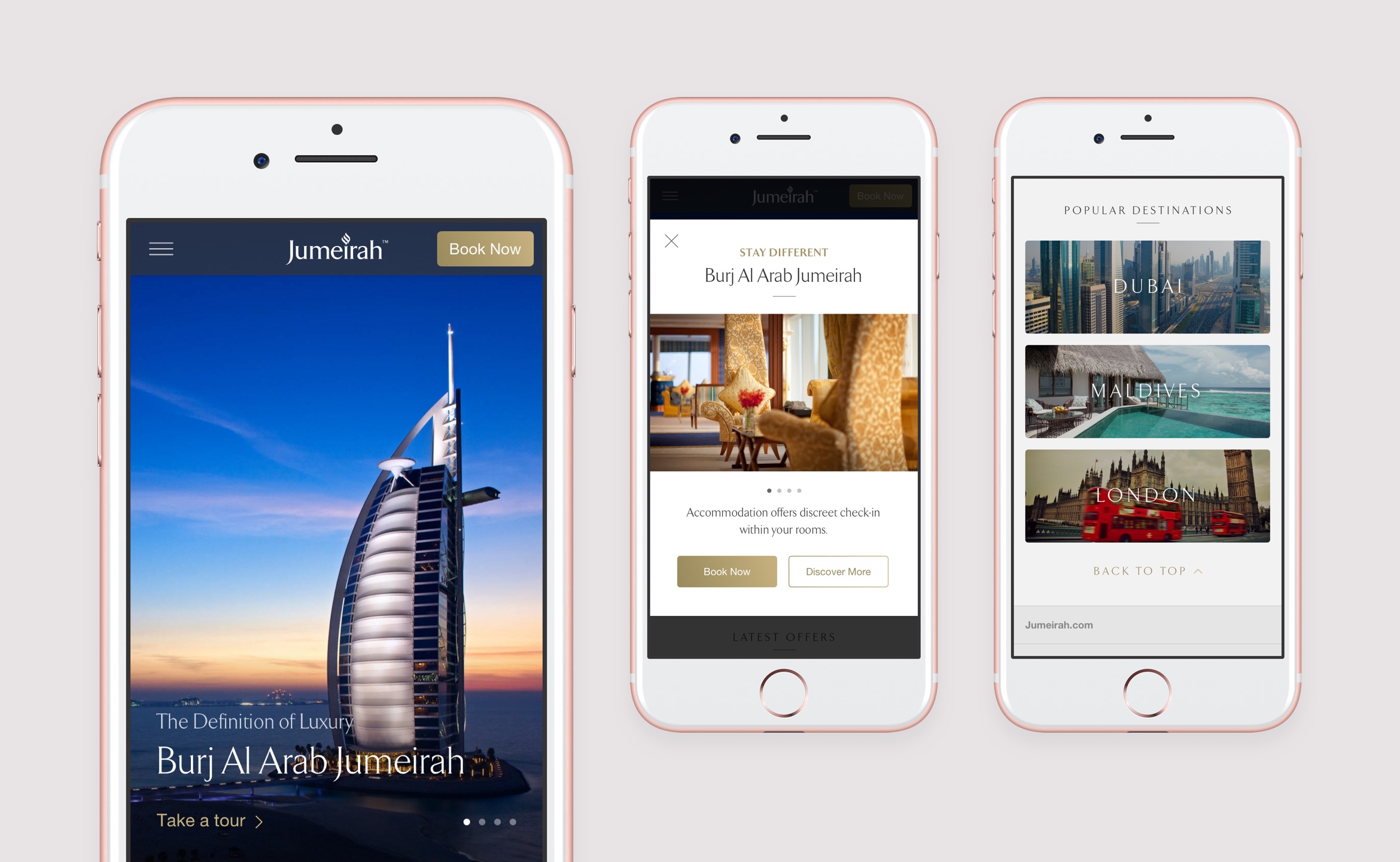
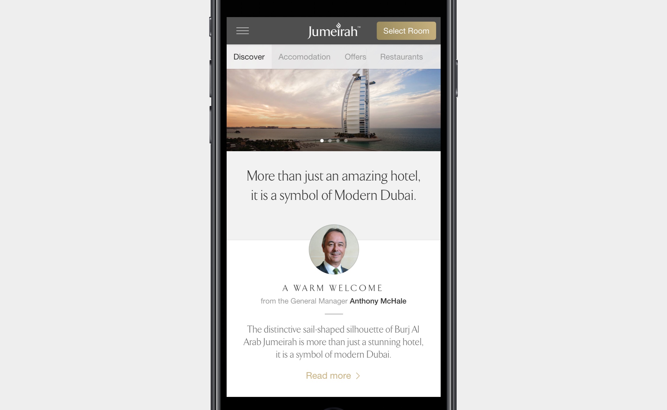
We positioned the brand experience around the booking process and followed an approach that relies on more imagery and minimal text. We believed that additional information and services should be displayed off-canvas to avoid any unnecessary distractions or visual clutter.
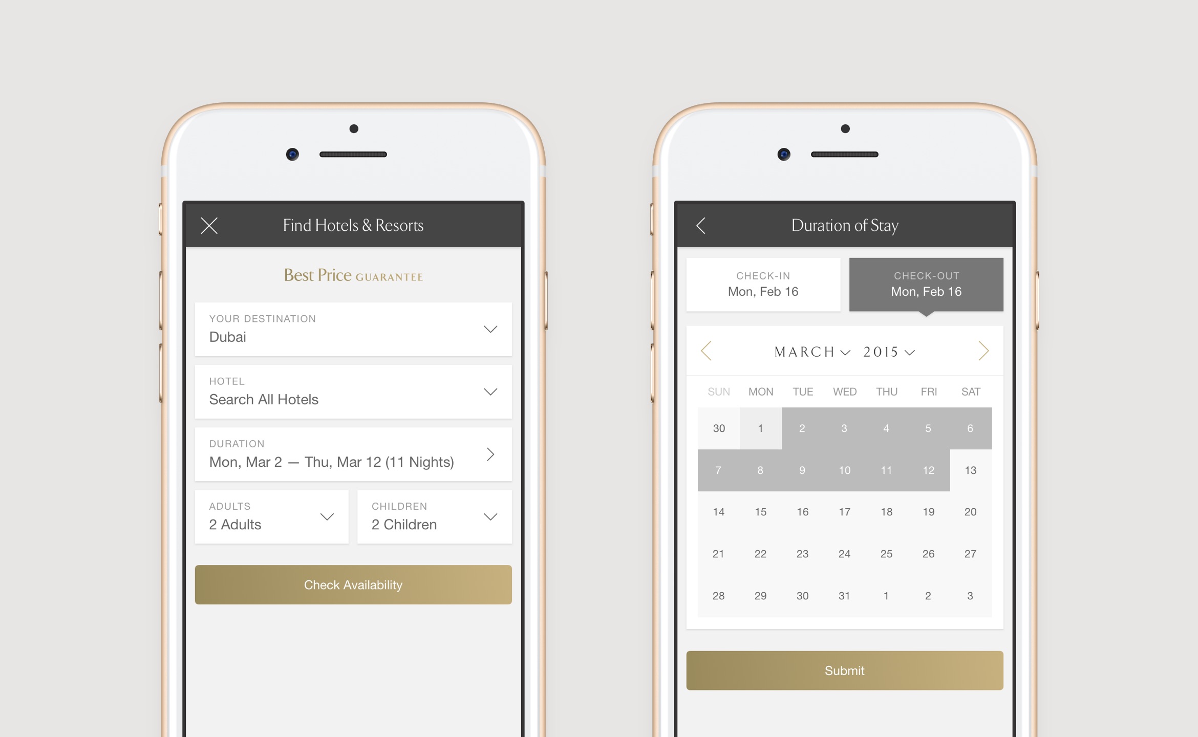
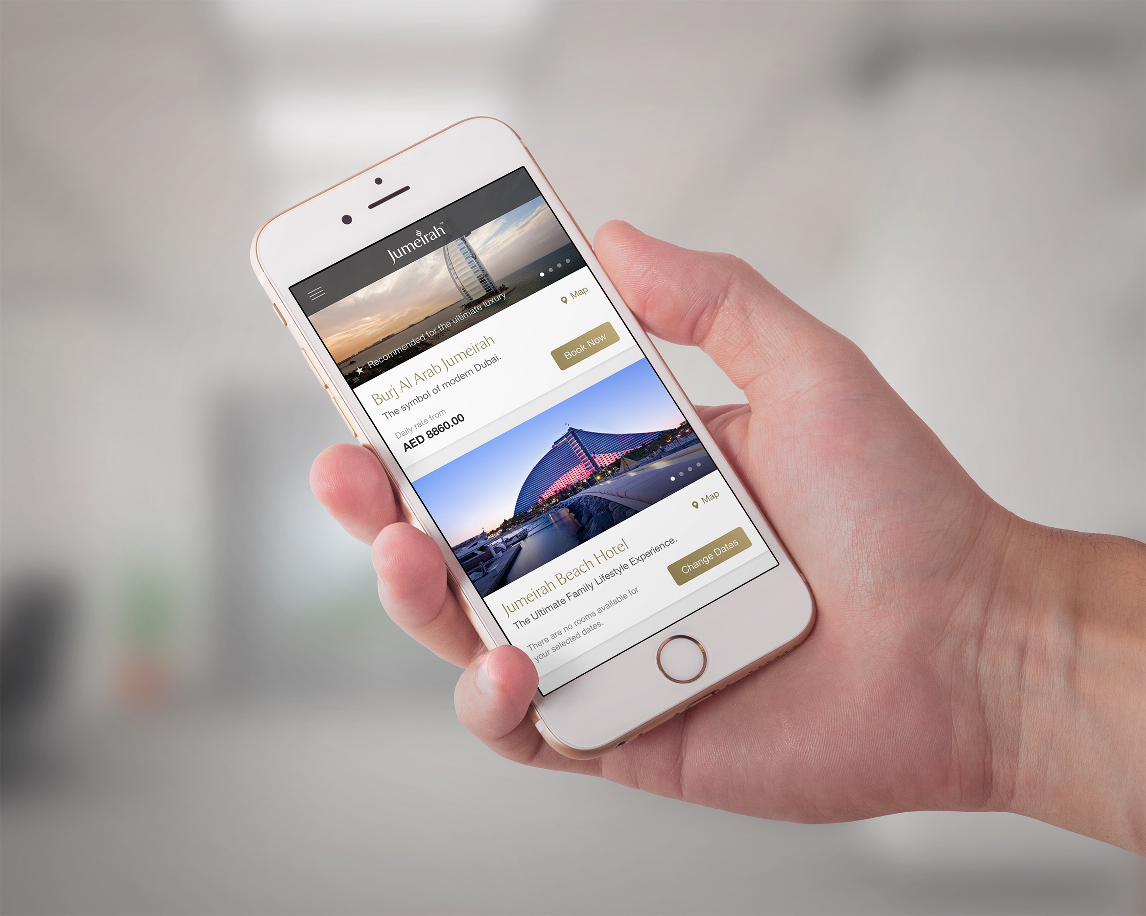
The desktop web sitemap was diluted into a mobile-only version, which resulted in much-simplified navigation. The homepage was built primarily with hotel search in mind, enabling users to search for rooms in a few simple steps. Users who prefer to take their time and browse were greeted by striking imagery of Jumeira’s luxurious hotels, in addition to tailored offers and top destinations.
We shortened the booking flow, making it much easier to choose a room, fill in personal & payment details and complete the booking.
We tried to ensure that our design decisions made sense, every step of the way through usability testing, which allowed us to iterate over our designs and rethink several of our choices.


