A fresh new look for Entercom’s Radio.com mobile apps
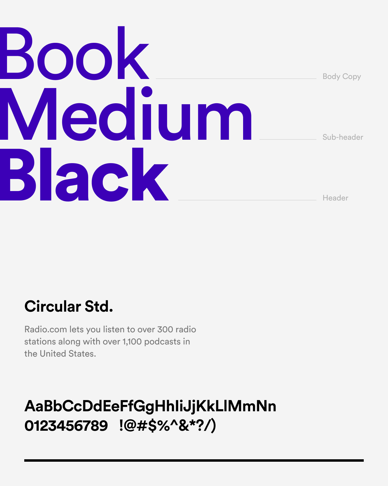
Radio.com lets you listen to over 300 radio stations along with over 1,100 podcasts in the United States. We redesigned the Radio.com iOS and Android apps to reflect the new brand refresh in Summer 2018 — moving towards a flatter and more lightweight interface with a modern, refreshing vibe.
Client
Radio.com (Media)
Date completed
September 2018
Project role
Lead Product Designer, TribalScale
The challenge
With over 6 digital products across multiple platforms, and a team occupying nearly half of our office space, Entercom — the second-biggest radio company in the United States — was TribalScale’s most prominent client in 2018.
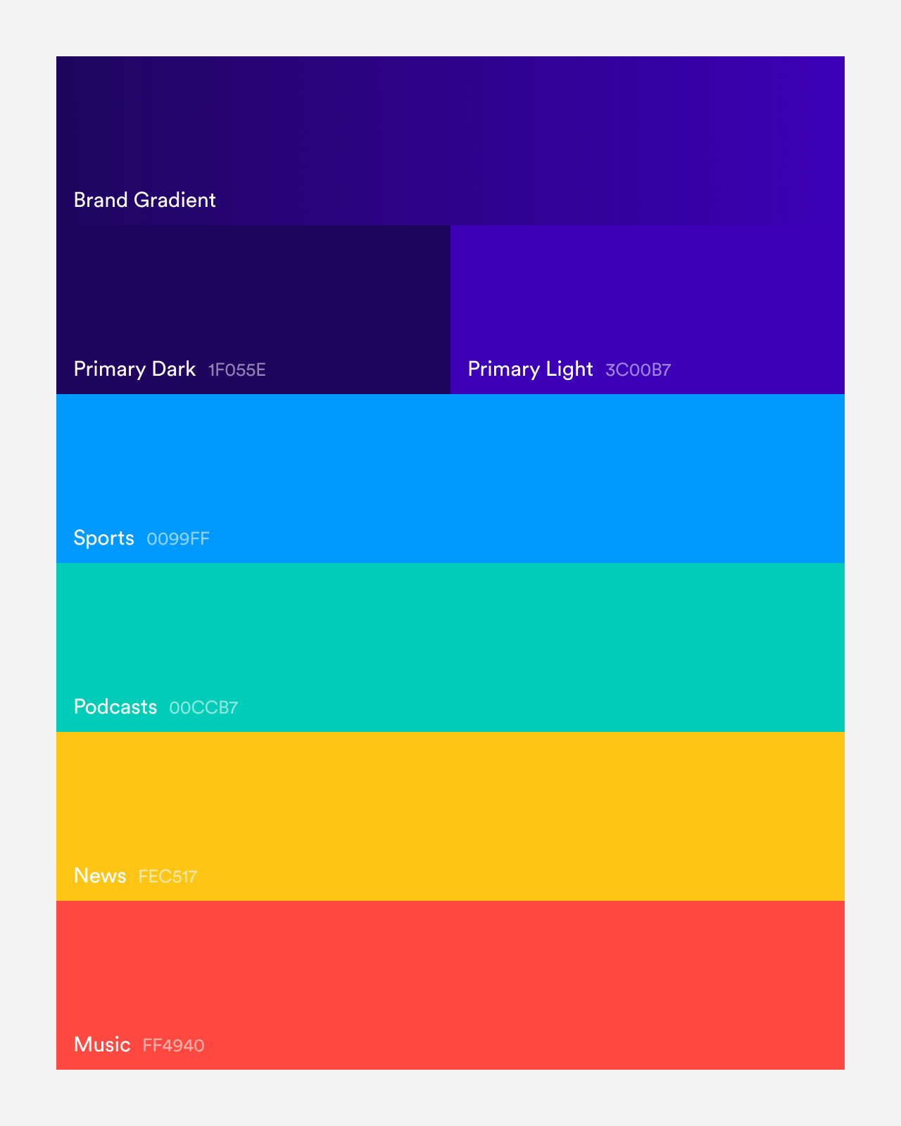
Radio.com is the national umbrella brand for Entercom’s radio network aggregating its over 235 local Entercom radio stations across the United States. The service also includes over 1,100 podcasts. In Summer 2018, the Radio.com brand went through a refresh that included a new logo, an updated selection of colours and a different typeface. As a result, all platform apps were destined for a redesign.
When I joined the Radio.com project, my first task focused on evolving the design aesthetic of the mobile apps to be in line with the new brand. Our goal as a team was creating a consistent experience for Radio.com’s listeners across all platforms as fast as possible.
Design
Music is one of the most significant sources of inspiration in my life. It allows me to connect memories associated with people and places, link all kinds of ideas together, and boost my creativity and productivity. It’s an essential part of my daily life, whether at home, at work or in-between.
Although Radio.com provides listeners with a wide variety of media content, music was probably the biggest reason why I was thrilled to be part of the project. The idea of creating a better and more engaging experience for people like me — who need their daily fix of music and radio content — was extremely appealing.
Another reason I loved that project is the type of content we were dealing with. All that gorgeous music album artwork was very inspiring, allowing us to craft elegant interfaces that are pleasant to look at and use.
The redesigned Radio.com brand features a new refined theme with strong vibrant colours and bold typography.
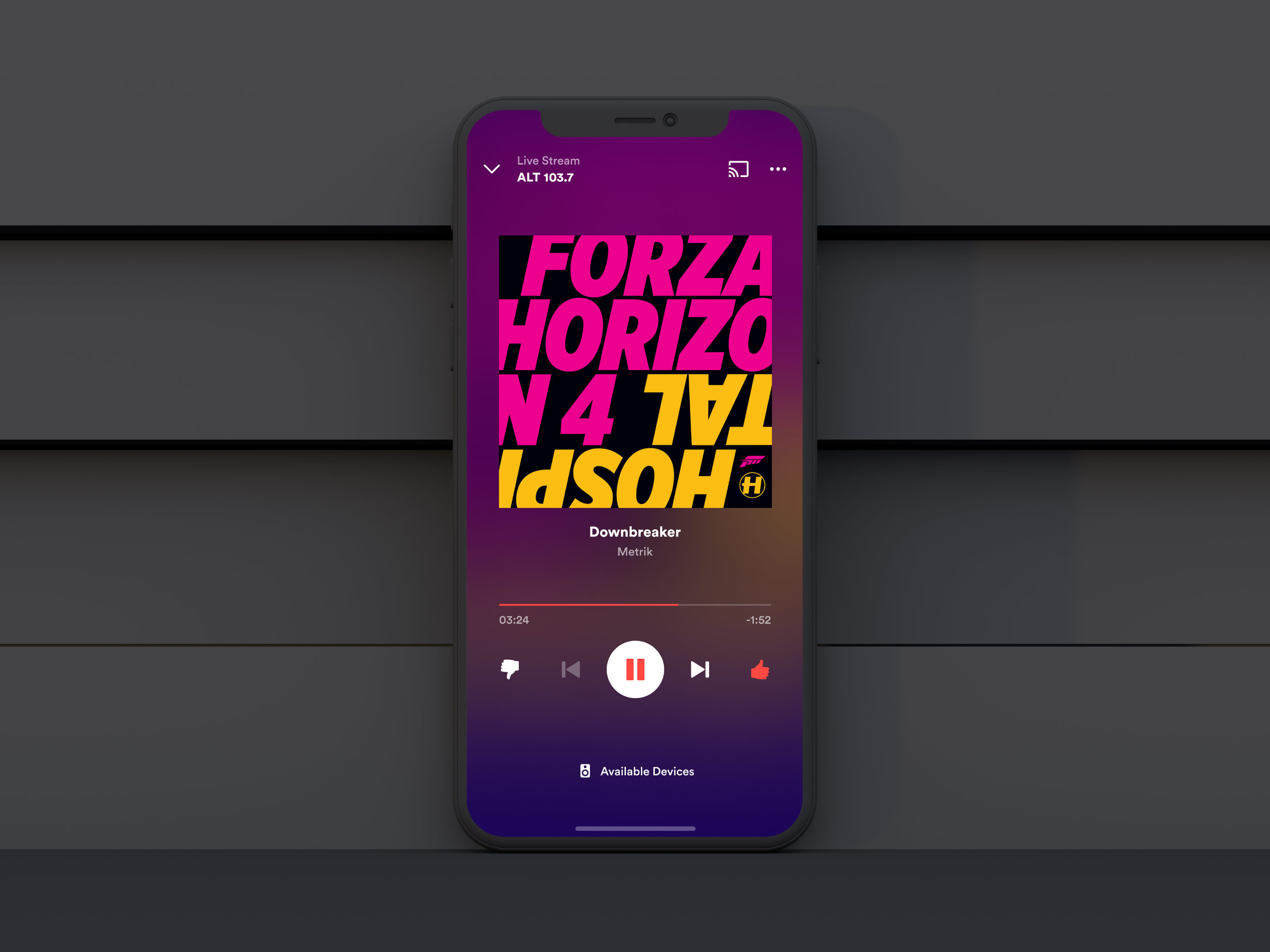
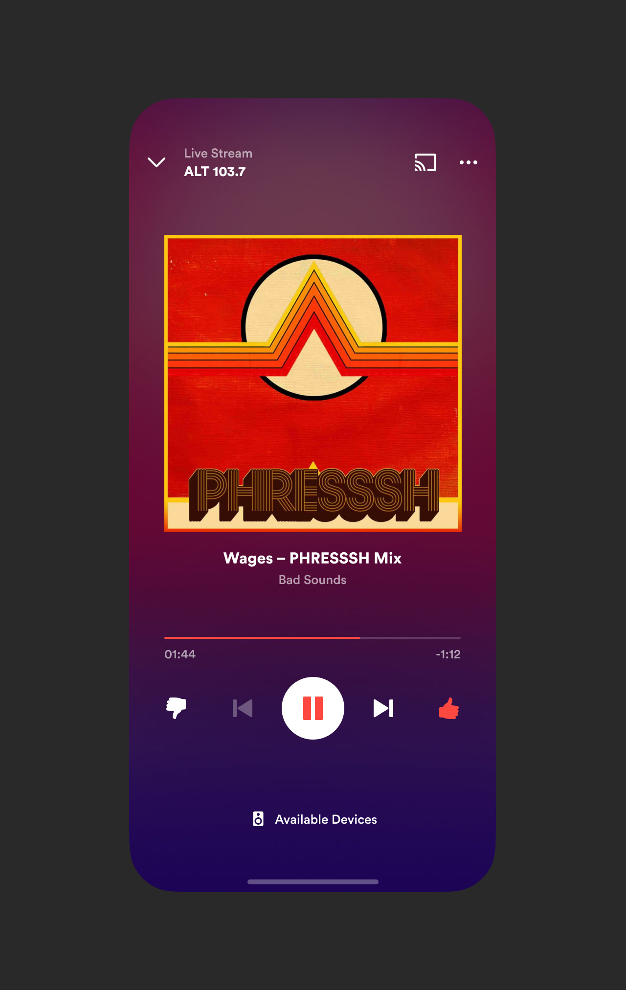
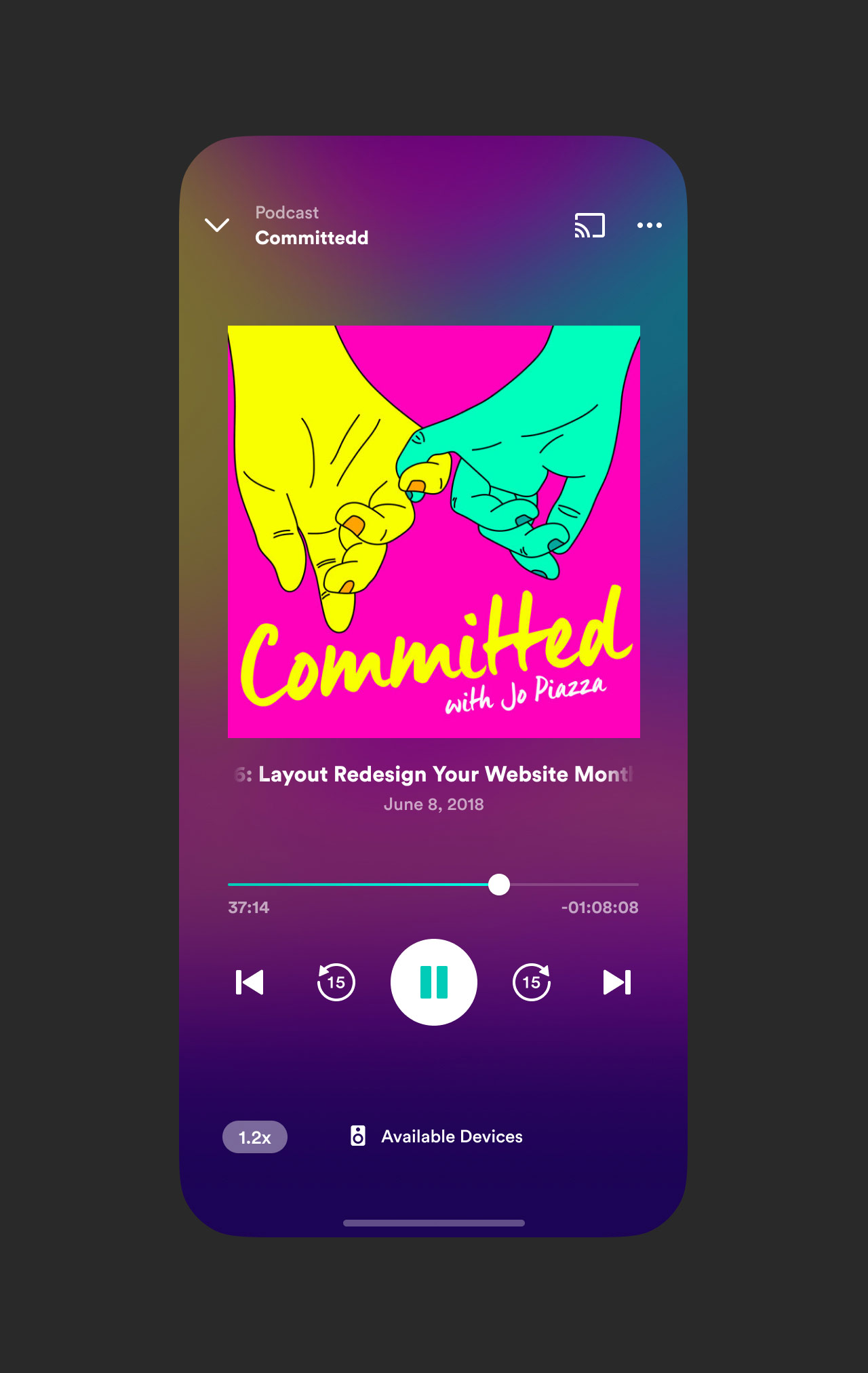
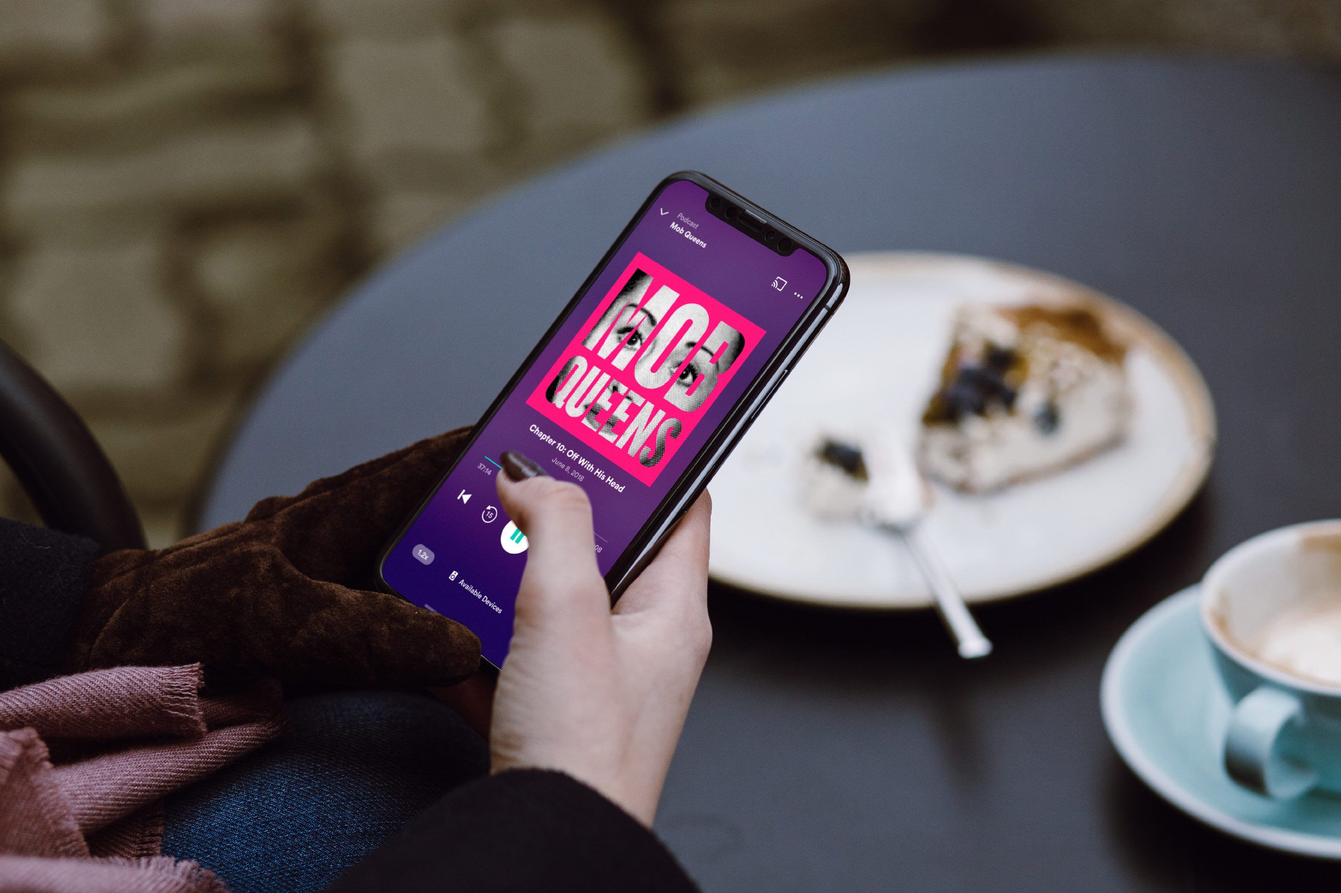
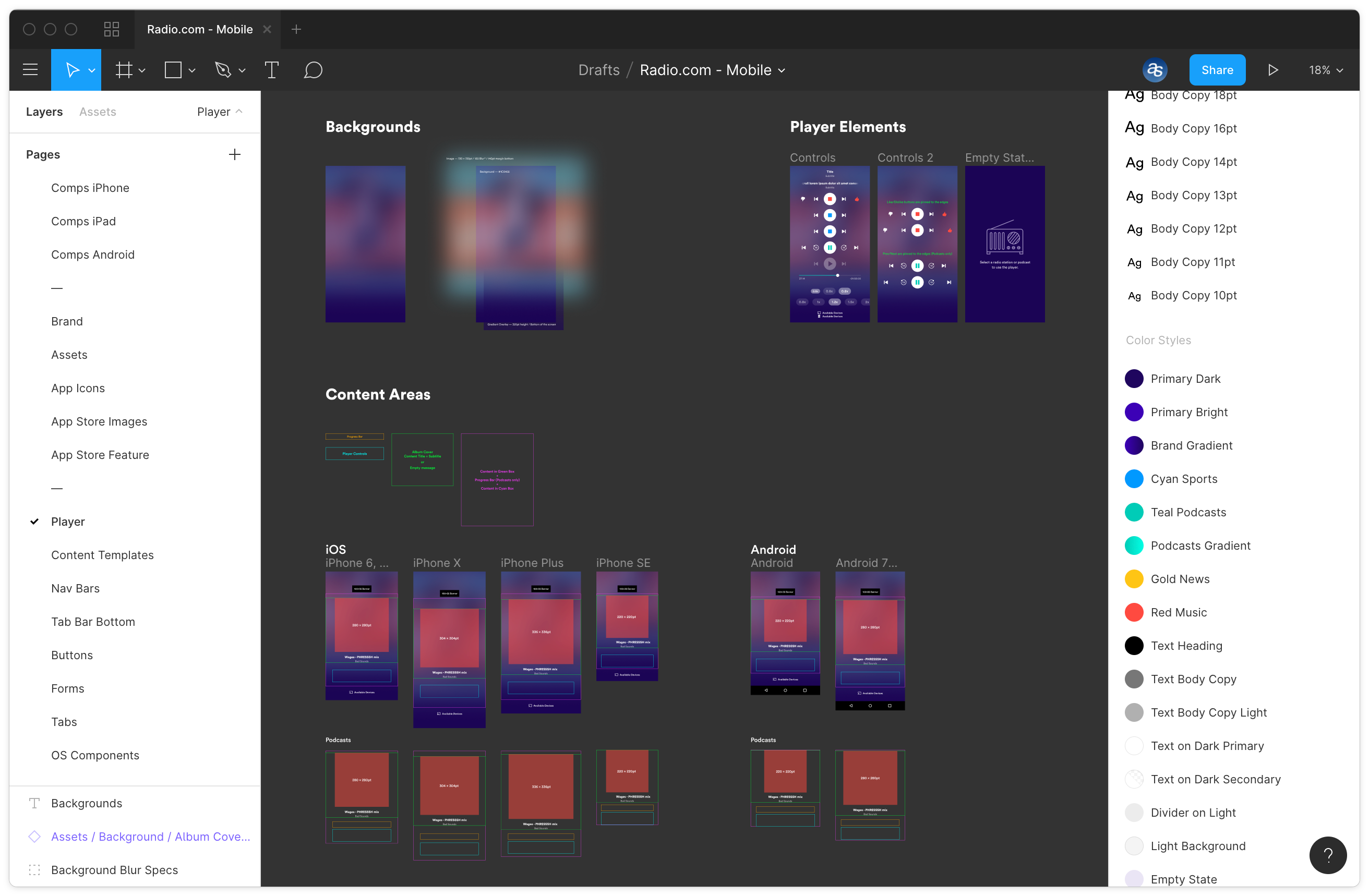
Designing a new player
I’m a big fan of starting with what you know and already had some ideas in mind to make the existing player design function and look better. Getting myself familiar with the various player functionalities and layout variations was the first step in the redesign process. For example, the radio and podcast player controls are distinct and feature different buttons that perform specific actions.
The next step was looking for inspiring music, radio and podcast players that were not overly designed and focused on pleasantly showcasing the content. The version we ended up using utilized a blurred version of the station or podcast covers mixed with the brand’s primary purple colour — allowing the content to do the heavy lifting. That gave the player a unique look each time a user changed a station or podcast, yet made them feel they’re at home in the Radio.com app.
The new player experience features distinct controls for radio stations and podcasts. The look and feel is unique to the content you listen to, thanks to the blurred background effect that is derived from the cover art of stations and podcasts.
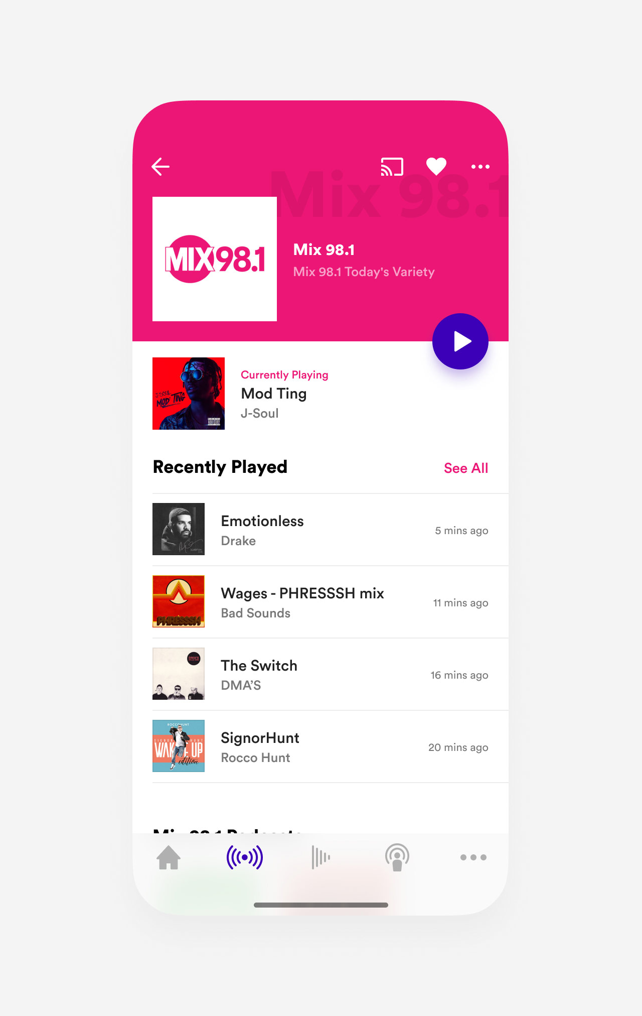
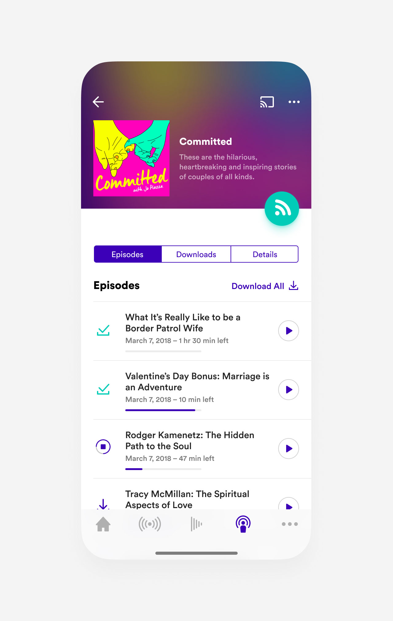
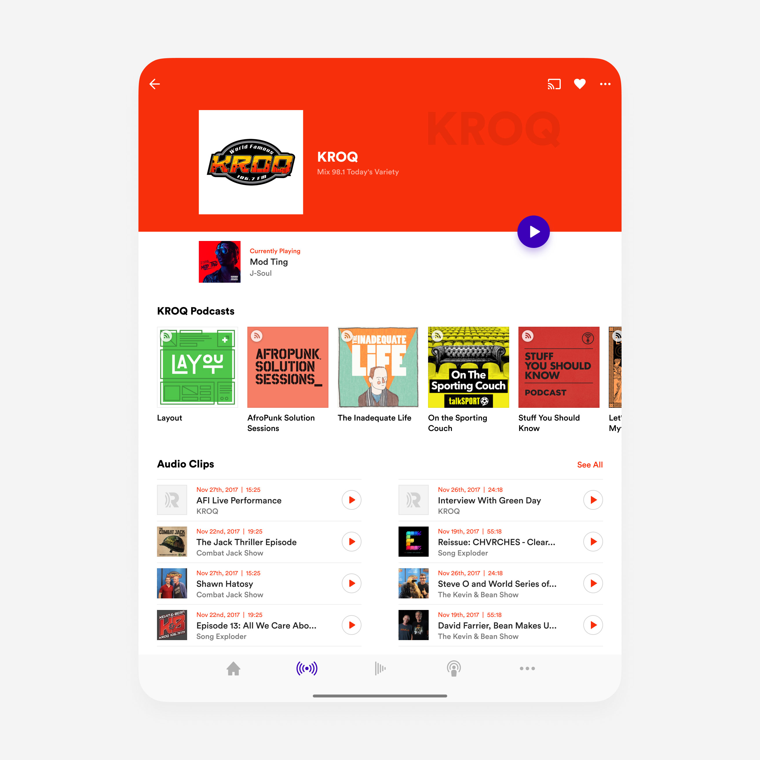
Branded station & podcast details pages
The station details page gives users an overview of the station’s recently played content and allows them to browse its shows, podcasts, and latest news. To make each station page stand out from the rest, we gave content editors the option of choosing a theme colour the reflects the station’s brand.
The podcast page is where users can learn more about a particular podcast, browse episodes and manage downloaded content. Since we didn’t want to overload content editors with the task of choosing a colour for each podcast, we utilized the same vibrant blurred background from the player.
The redesigned station & podcast pages features a design language similar to that of the player where each page gets its own unique look.
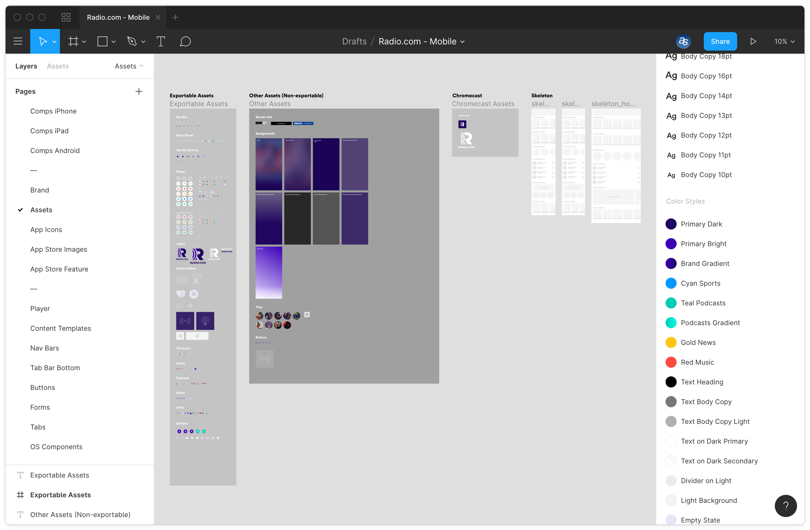
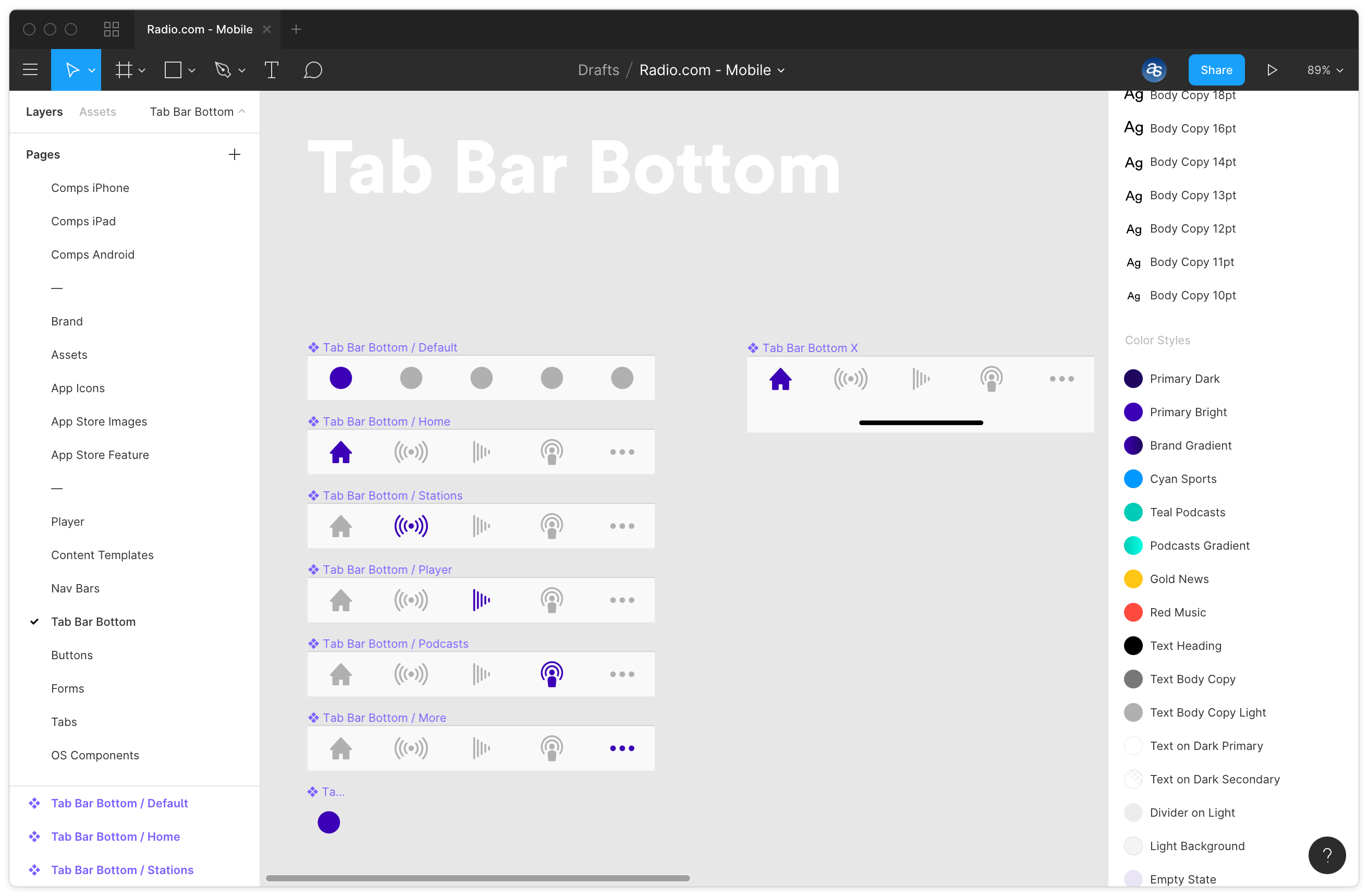
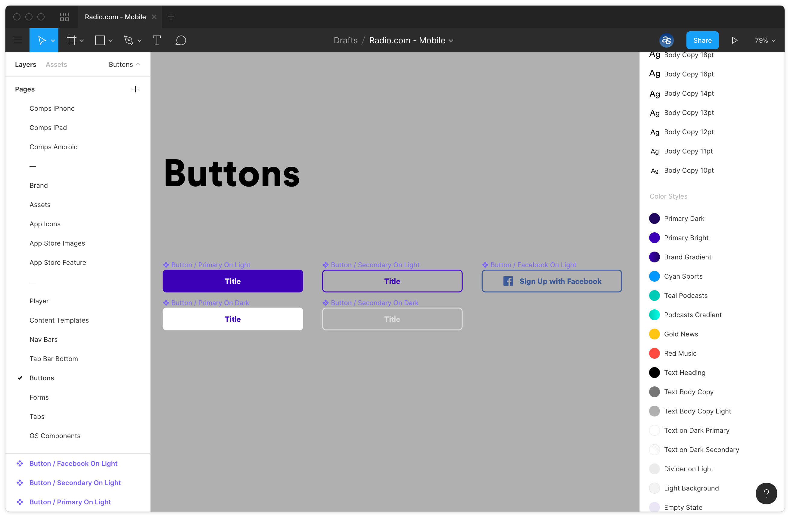
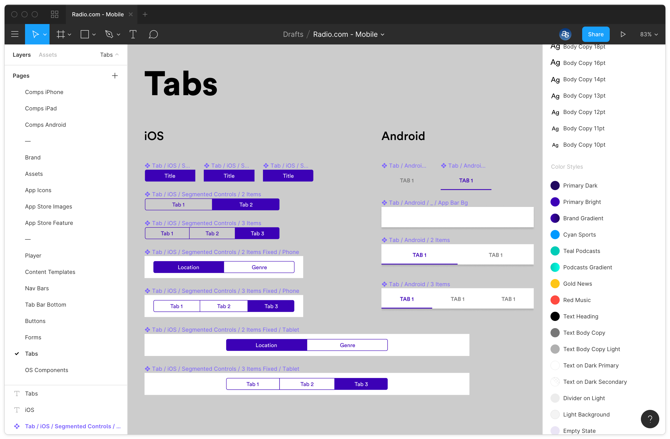
Highlights from the design system
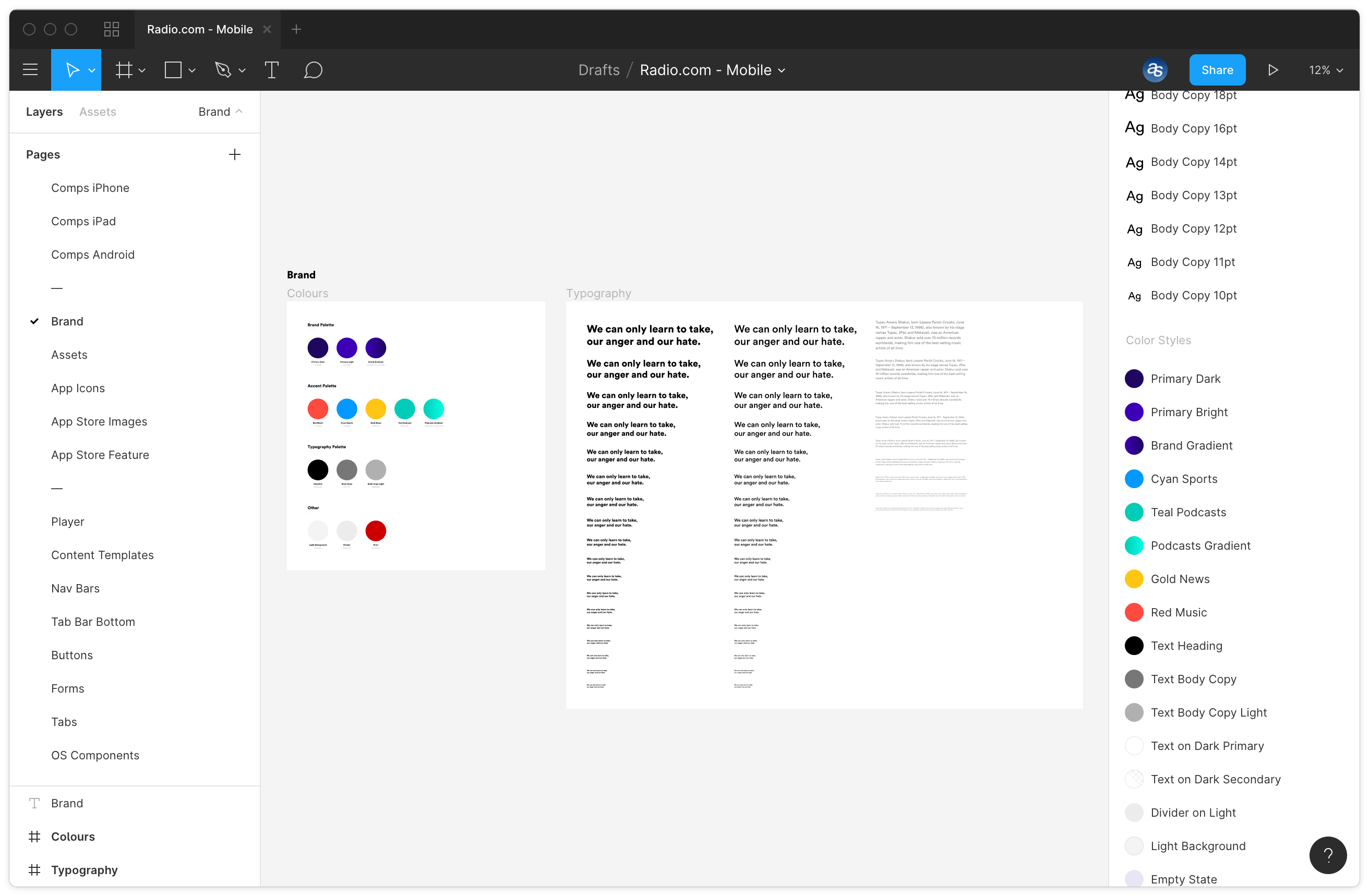
The Radio.com redesign project was an opportunity for us to experiment with Figma, given the collaboration flexibility it provides the entire team, and not just designers. What sold me on it, however, is how it handles colour, text and effect styles. Unlike Sketch, Figma gives us the option of separating these styles, making it seamless to apply them interchangeably to the same layer. For example, you can apply a header text style to a specific layer and also use the brand’s primary colour that is defined in another separate colour style. In Sketch, you would’ve had to combine the 2 styles. In addition, Figma has built-in tools for inspecting designs and creating prototypes — replacing Zeplin and InVision, respectively.
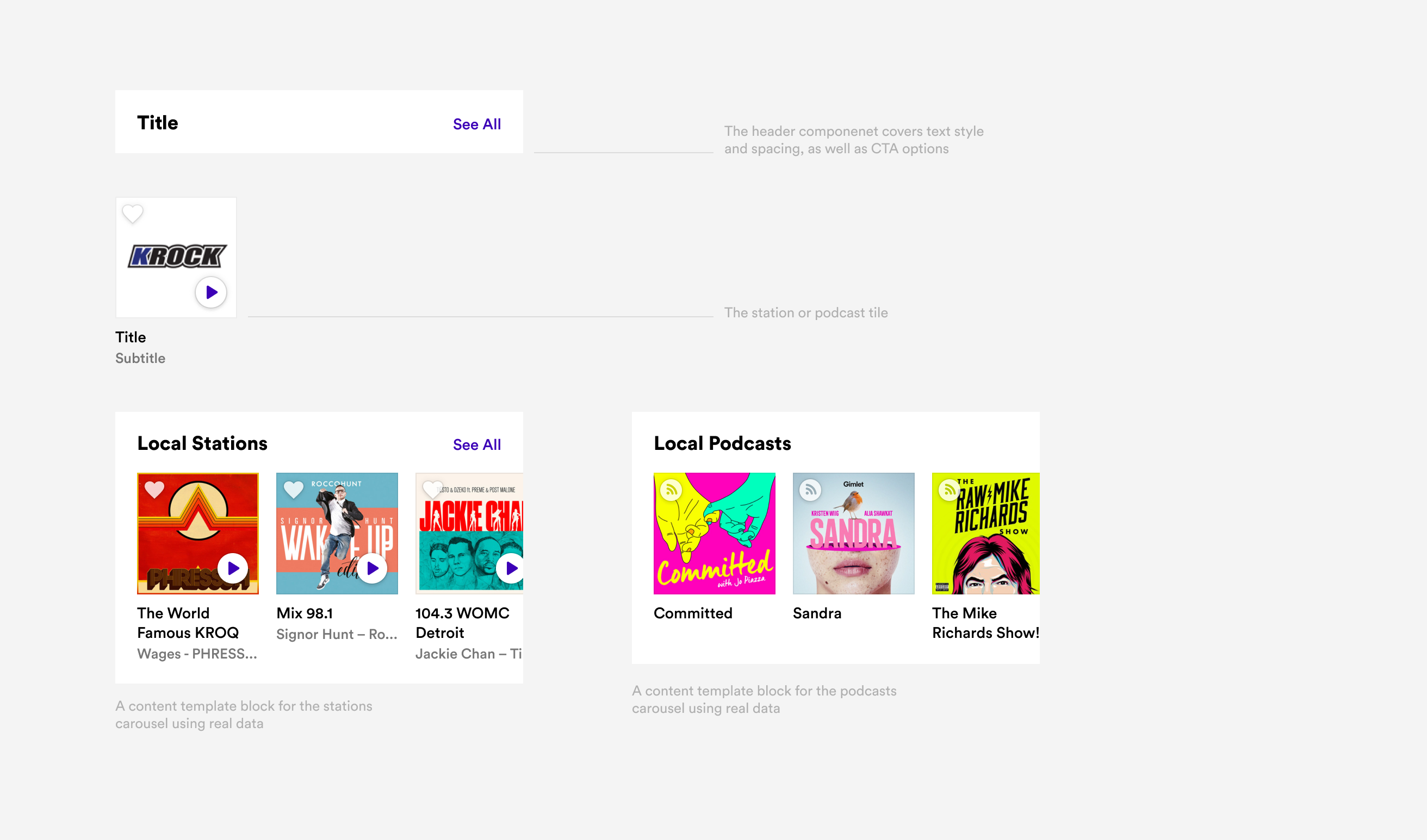
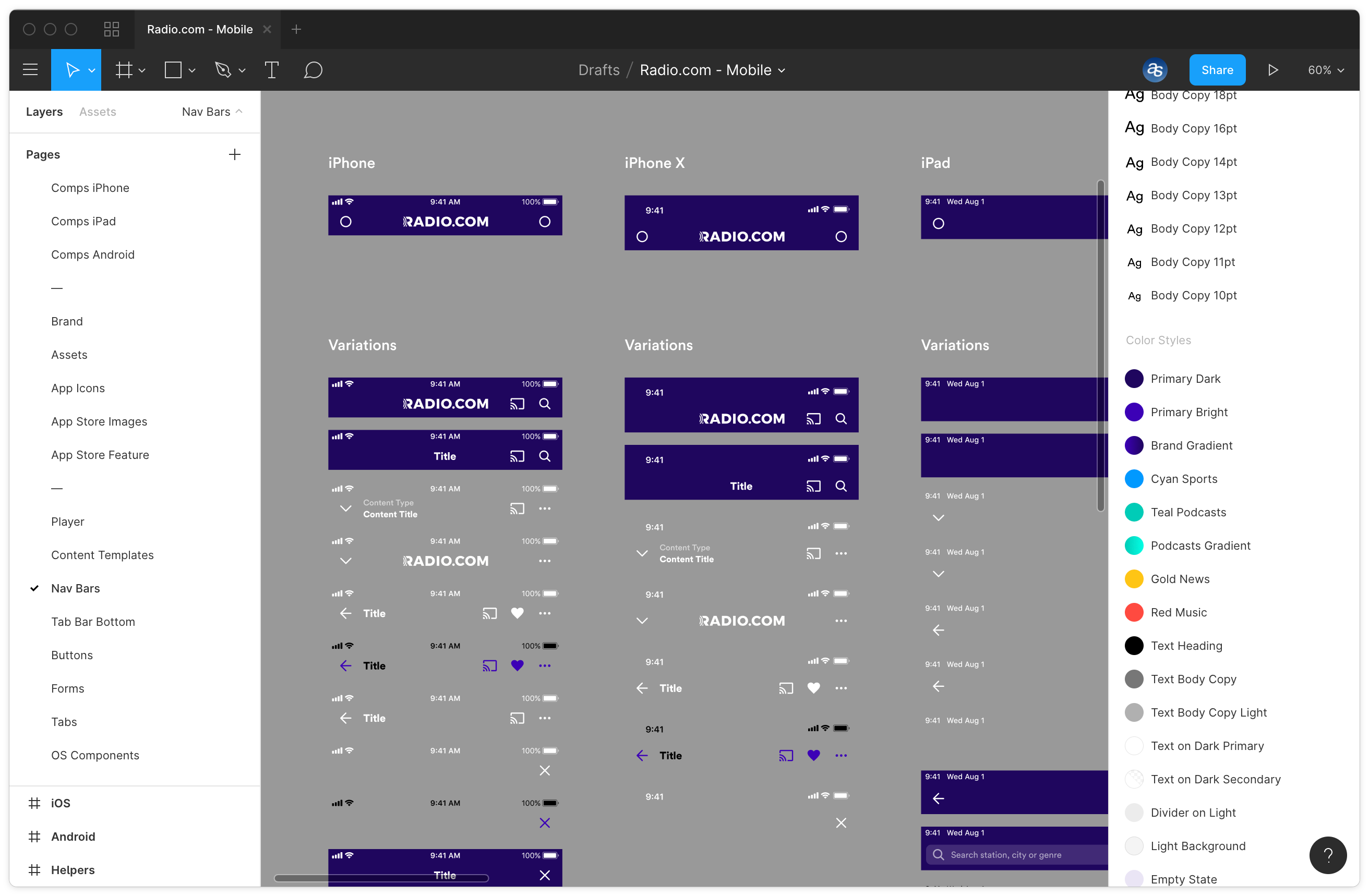
The approach we took for the design system followed a much-simplified version of Brad Frost’s Atomic Design. Brand elements (colour and typography) were converted to Figma colour and text styles. All UI Elements were categorized into components. A tab bar is a component. A text input field is a component. A button is a component. And so on.
To better handle repeated data, we created a section called content templates that allowed us to reuse a particular set of components on multiple pages. For example — we had several carousels for stations and podcasts that use the same collection of cover artwork and text. By putting them in a content template, any change we made in the content would reflect on all layouts (iPhone, Android, and iPad), regardless of the design of the actual component.
Our design system was implemented using Figma, giving us the flexibility of working together as a design team and sharing our work with the client and rest of the team. The structure we used relies on simple components that can be reused throughout the app. On the left-hand side, you can see the page structure we set, which divides the project into design comps, brand assets, and UI elements.
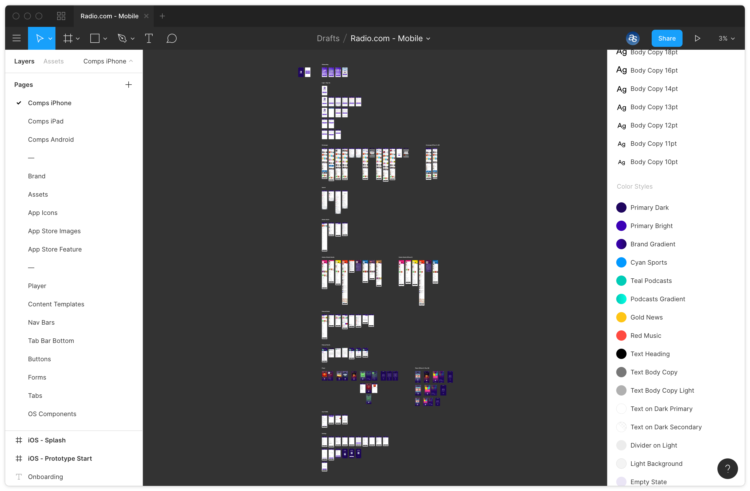
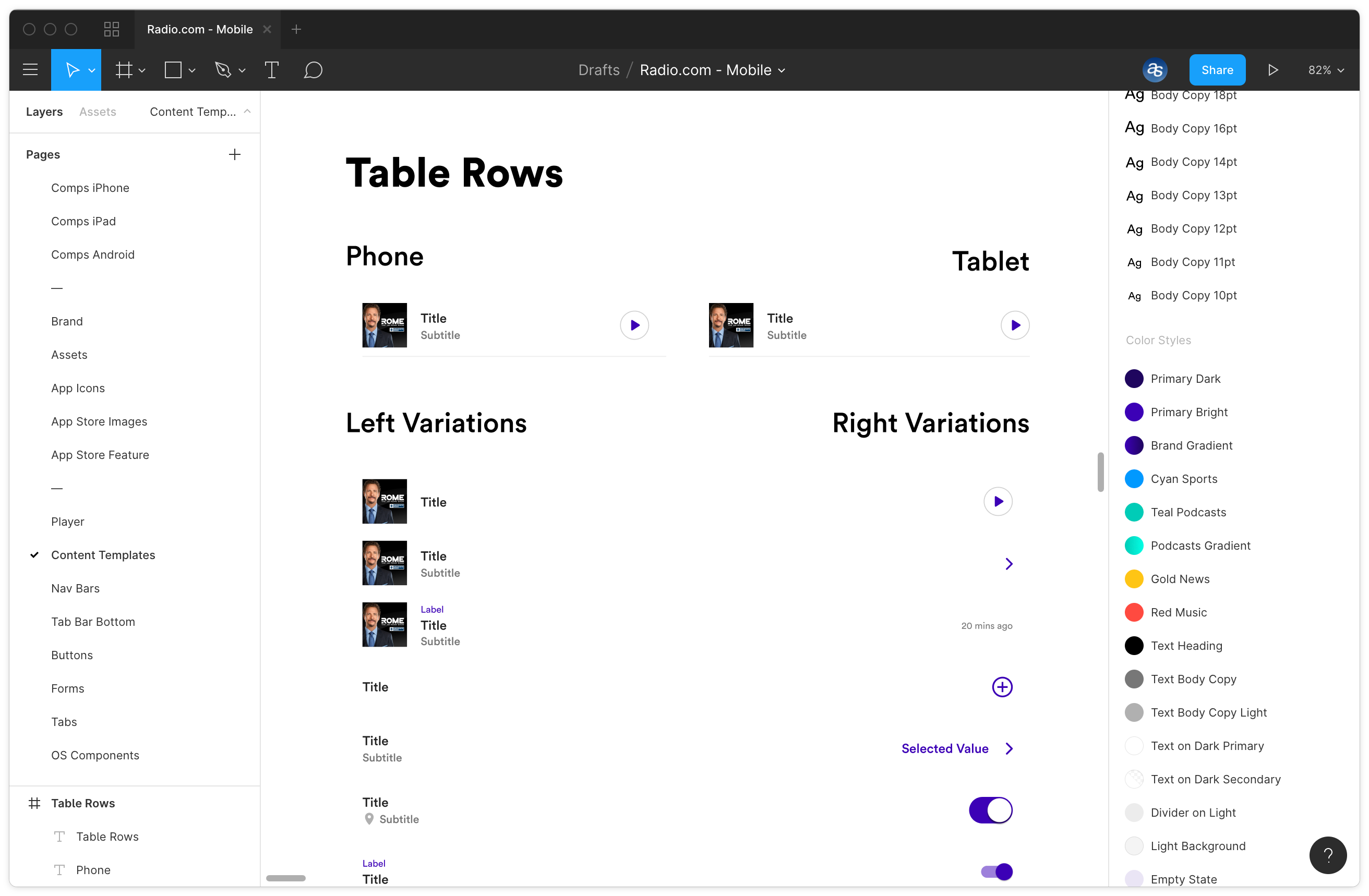
Content templates make it easy to reuse repeated blocks of real content such as station and podcast carousels that are used throughout the app sections.