Reimagining the Etisalat retail digital signage experience
Etisalat, the UAE’s leading telecom service provider, approached us to reimagine the digital signage experience in their new stores. Using a research-led approach, we built a strategy that empowers staff and enables customers to interact with products, services, and the brand in new meaningful ways.
Client
Etisalat (Telecom)
Date completed
November 2016
Project role
Service & Lead Visual Designer, Fjord
The challenge
In early 2016, Etisalat set up an in-house Design Studio in Dubai with the help of Fjord, to drive innovation and enhance the customer experience. Backed up at an Etisalat board level, Fjord designers worked alongside client stakeholders and communicated efficiently with various business units. That led to increasing the delivery pace and the quality of digital products and services.
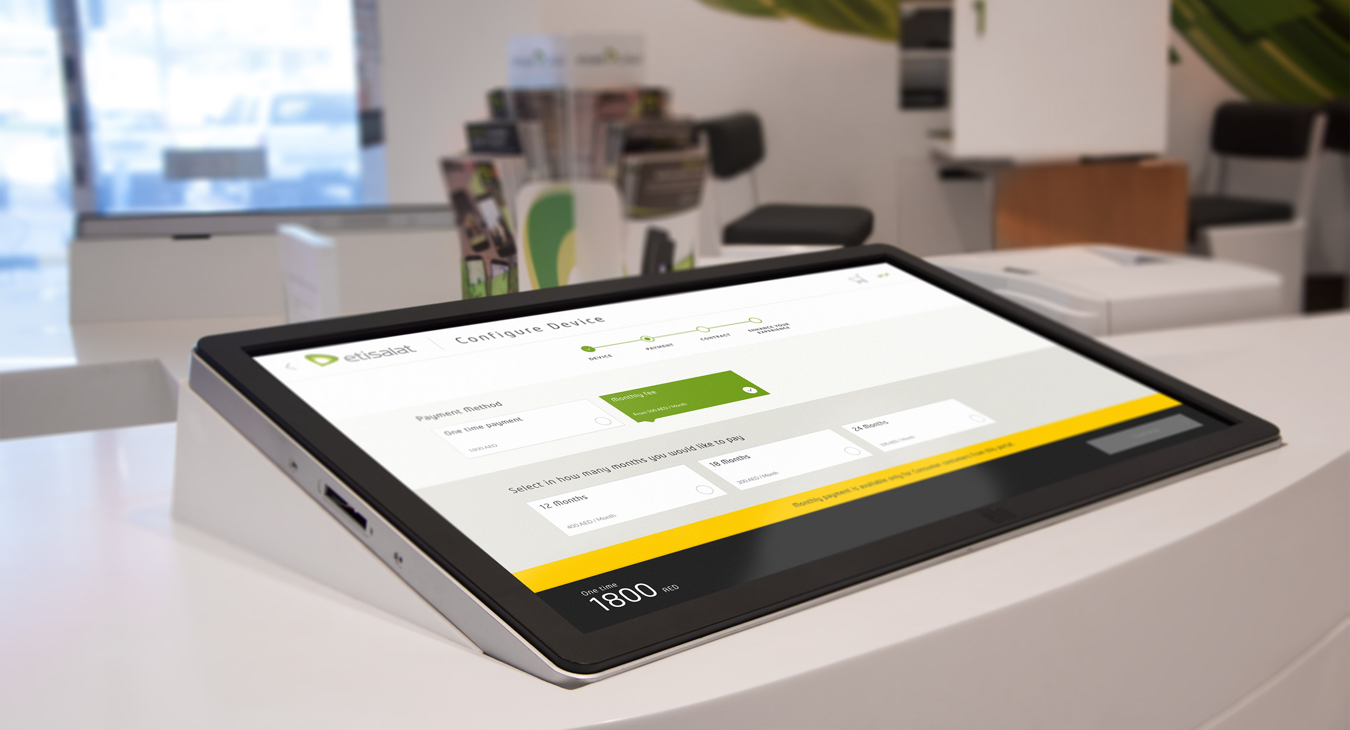
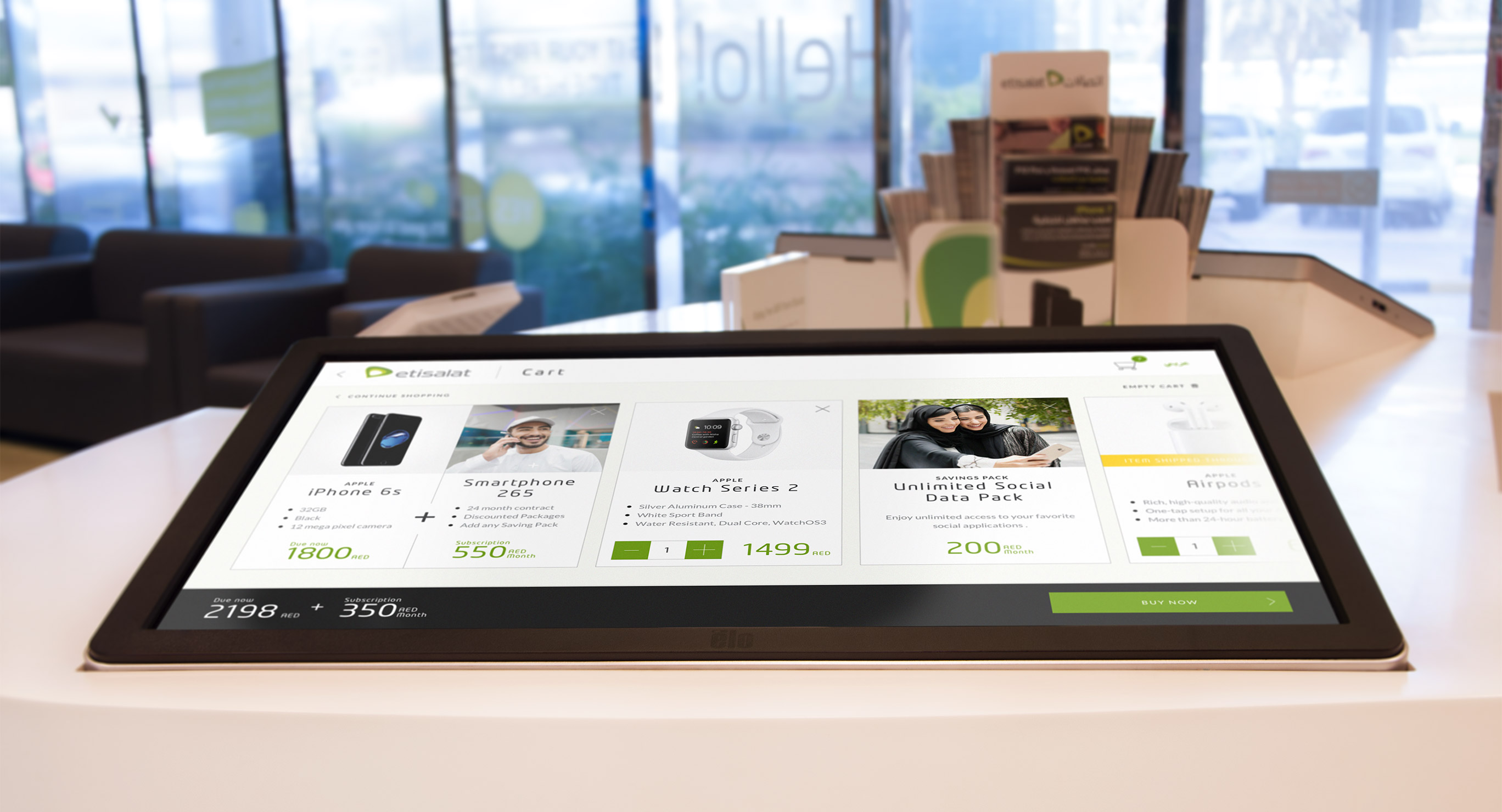
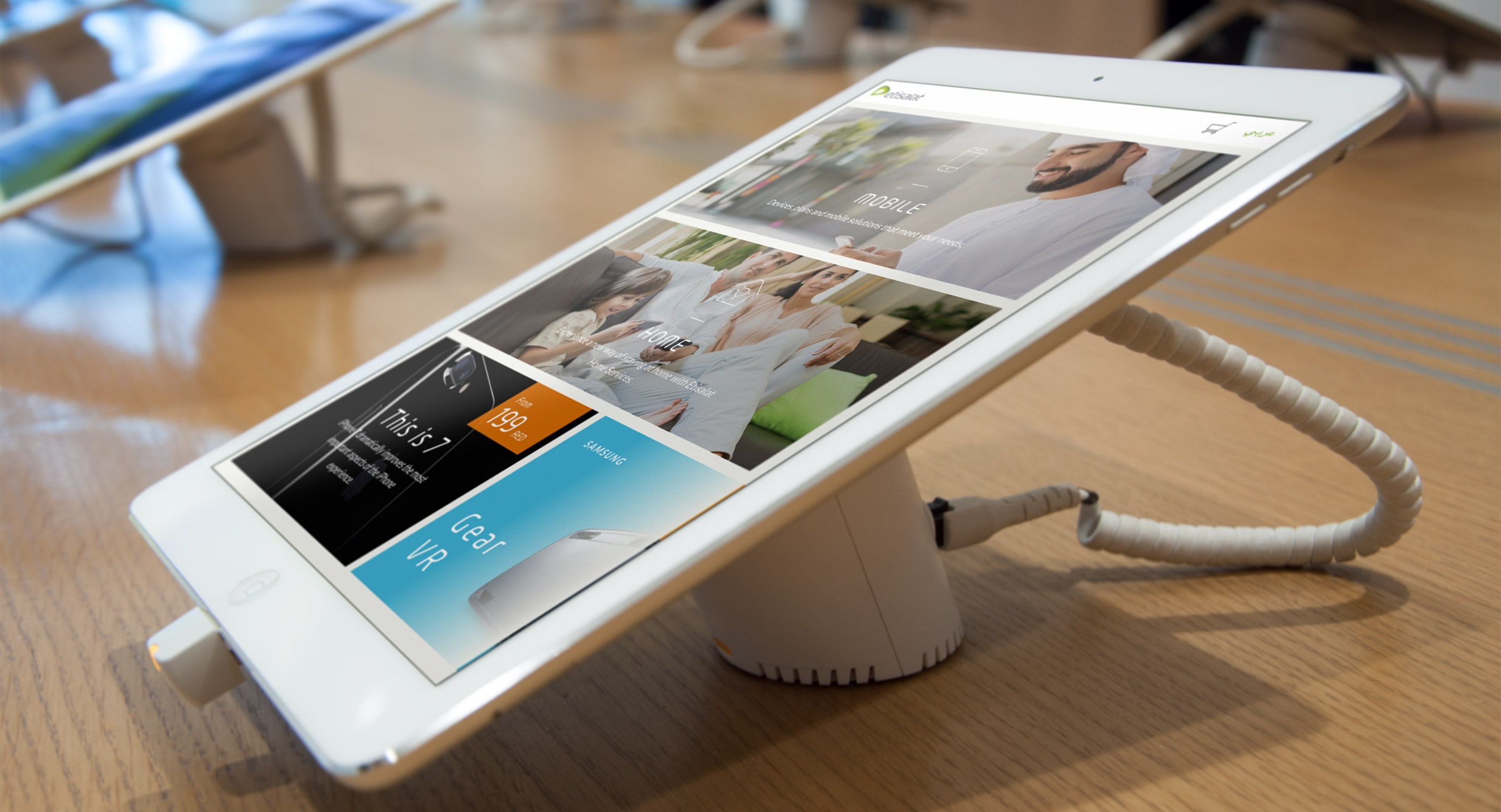
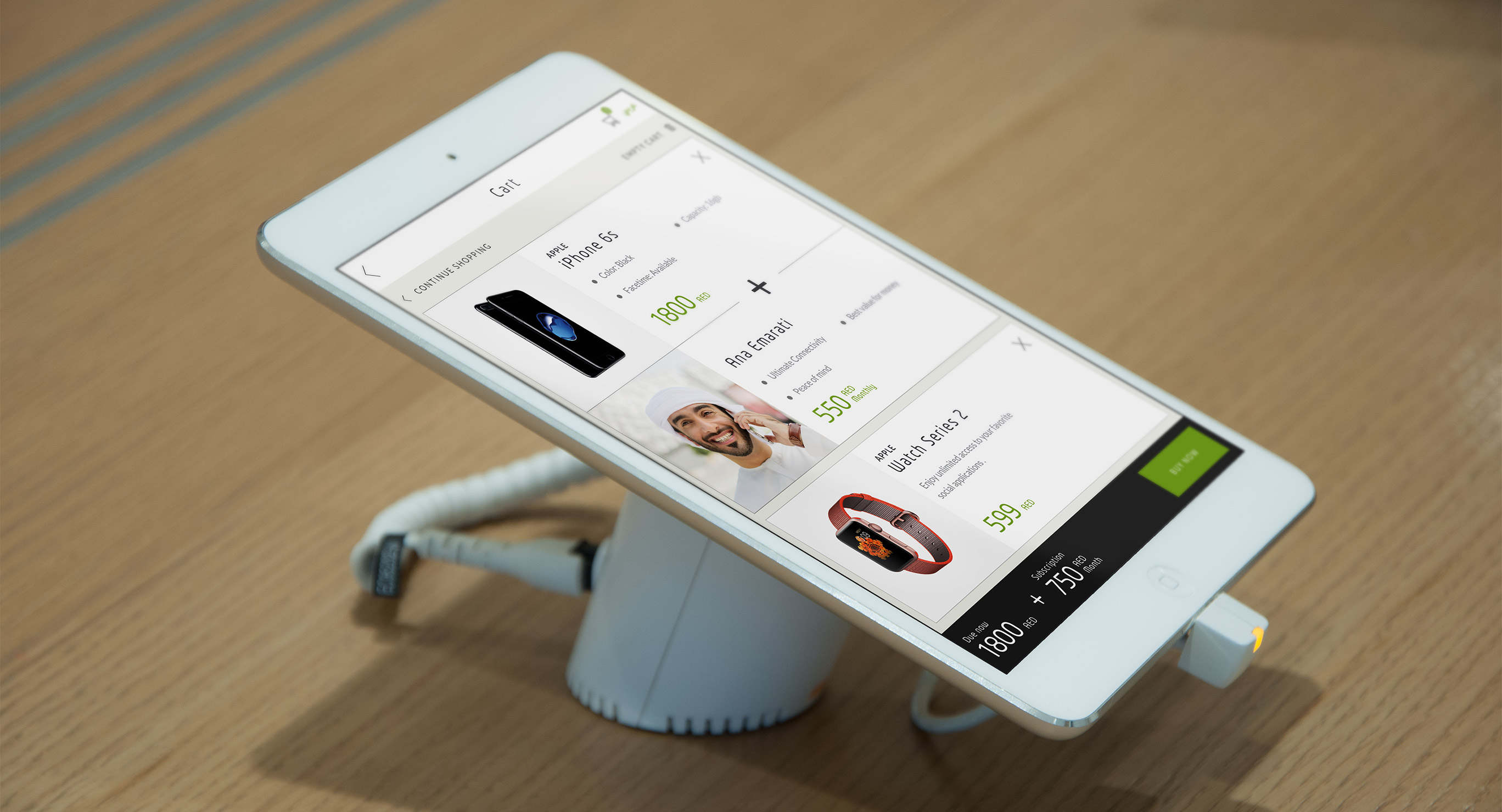
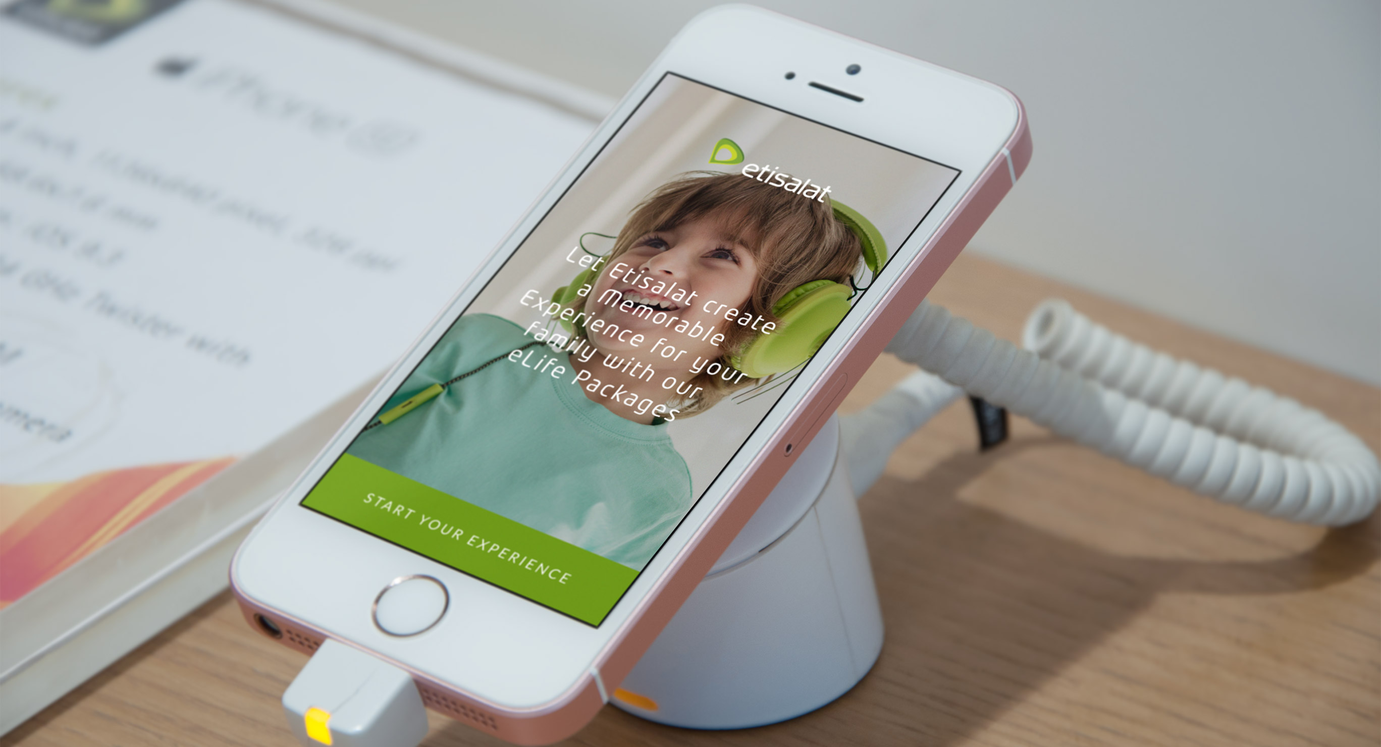
During that time, Etisalat was revamping its retail stores, and transitioning them into spaces that are smarter, more efficient, and more customer-centric. Stores would act as innovation hubs that showcase Etisalat’s various offerings in an immersive, hands-on experience. To promote that vision, Etisalat added a wealth of displays, from iPad tablets to 120-plus inch touch displays — giving customers a glimpse into the world of smartphones, internet, and TV.
To better realize the potential of those displays, the Etisalat retail team reached out to us to evaluate the current digital signage experience, and to find opportunities that would increase customer engagement in stores.
Our approach
I worked alongside 3 other designers to evaluate Etisalat’s digital store experience and define the strategy that would potentially increase customer engagement. My role involved applying service design and user research methods in the initial discovery activities and leading the visual direction for the design concept.
We wanted to build a customer-focused product roadmap, from quick-wins to long term strategic initiatives — enabling customers to manage their relationship with Etisalat better, discover and buy new products and services, and engage more deeply with the brand.
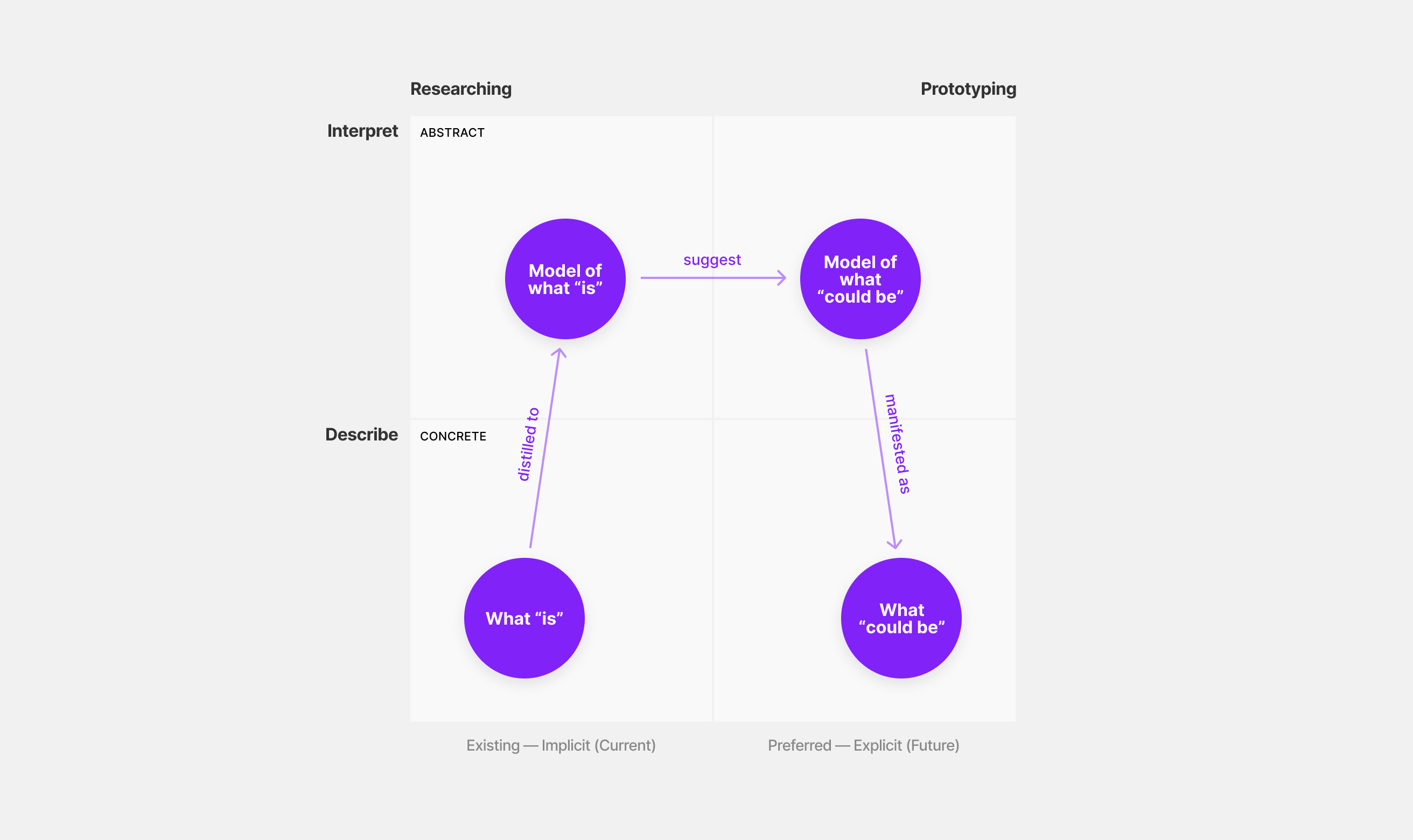
We followed the Analysis-Synthesis Bridge Model, where we observed and investigated the current state to define the core problems and then created a model of how we saw the future. As we transitioned from discovery to execution in future phases, the project went through an iterative design process that relied on prototyping and usability testing.
The Analysis-Synthesis Bridge Model illustrates one way of thinking about the path from analysis to synthesis. By using models, we can frame research results and possible futures. [Hugh Dubberly, Shelley Evenson and Rick Robinson]
Research
A research-led approach was necessary to identify problems and pain-points and deliver actionable insights and solutions. By connecting all types of pain-points, whether customer, staff or business-related, we were able to craft a long-term strategy that provides customer and business value.
Analogous inspiration to spark creativity
It was the first time our team had an opportunity to work on a digital signage project — besides our Service Design Lead, who gave us a lot of guidance. To get things started, we wanted to get inspired by best in class experiences that demonstrate the variety of ways other companies treat digital signage in physical spaces. We didn’t limit our inspiration to the technology sector only. We also looked for analogous digital signage executions — from clothing and fashion to art galleries and expos. During our research, we noticed that experiences were either playful or buttoned-down when it came to how they looked and felt. In addition, they either promoted exploration or guided the user in a flow to complete a specific task.
The examples inspired us from a design perspective, interaction perspective, and service consistency perspective. They also helped us craft visual, content, and technology guidelines that create consistency and streamline experiences for Etisalat customers.
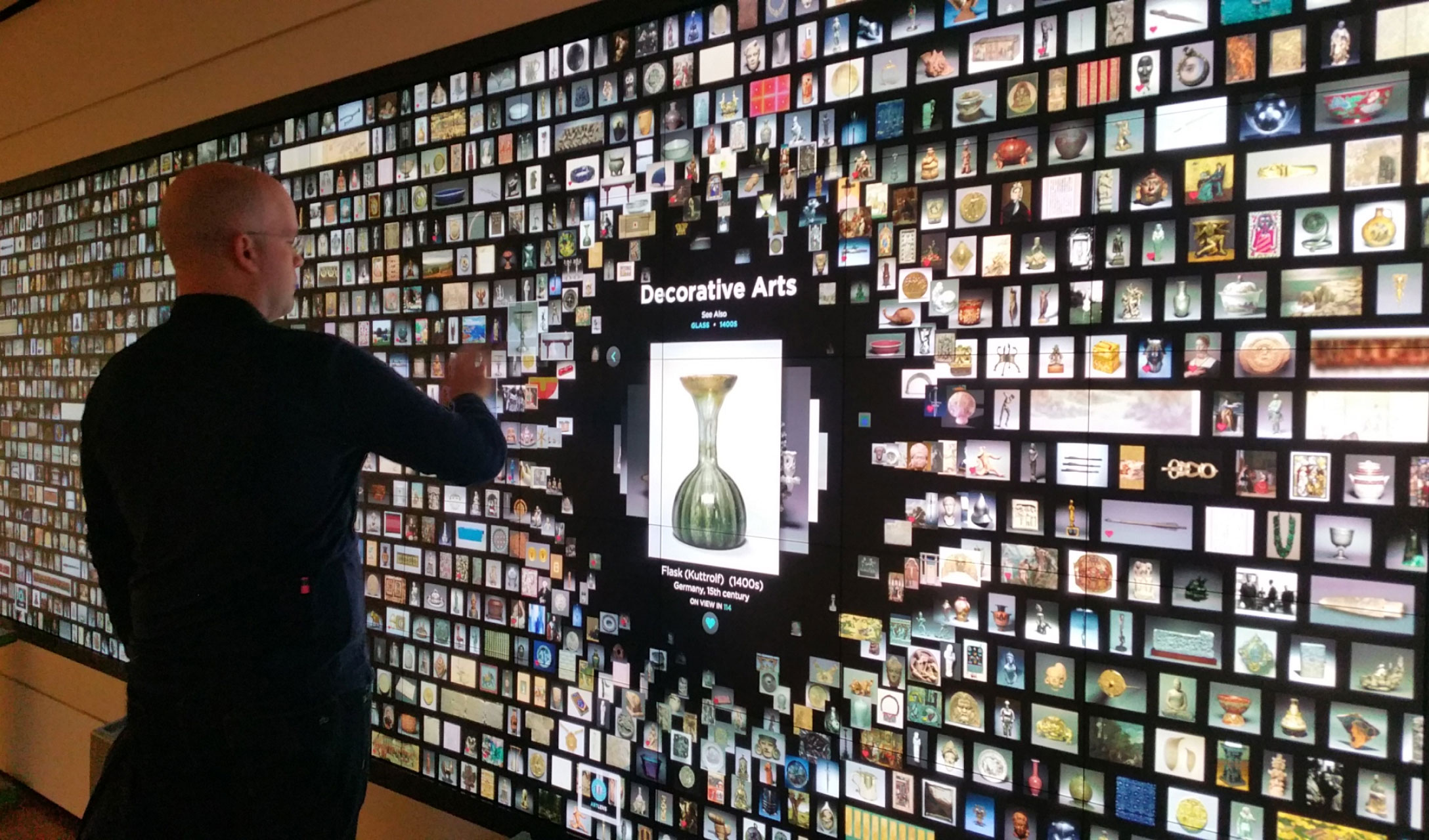
The ArtLens Wall at Cleveland Museum of Art is a 40-foot interactive wall that displays in real-time all works of art from the permanent collection currently on view in the galleries. It promotes discovery and dialogue with other visitors and can serve as an orientation experience. [Photo: Conxa Rodà, Blog Museu Nacional d’Art]
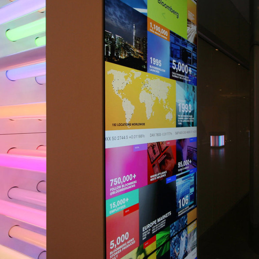
Bloomberg Visitor Experience Installations create an engaging first impression and invite visitors to tap into the world of Bloomberg’s living network. [Photo: Studio of Cinematic Architecture]
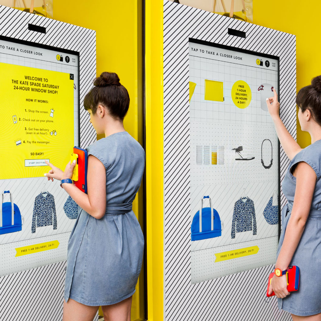
Kate Spade Saturday 24-Hour Shops make it easy and fast to get fun, summer products to you anywhere, anytime in NYC in less than an hour. [Photo: Allison Henry Avery]
Exploring the current experience
Understanding how the existing experience worked and how customers interacted with the space and the various touchpoints was key to defining the core issues and uncovering new opportunities that fueled our ideation.
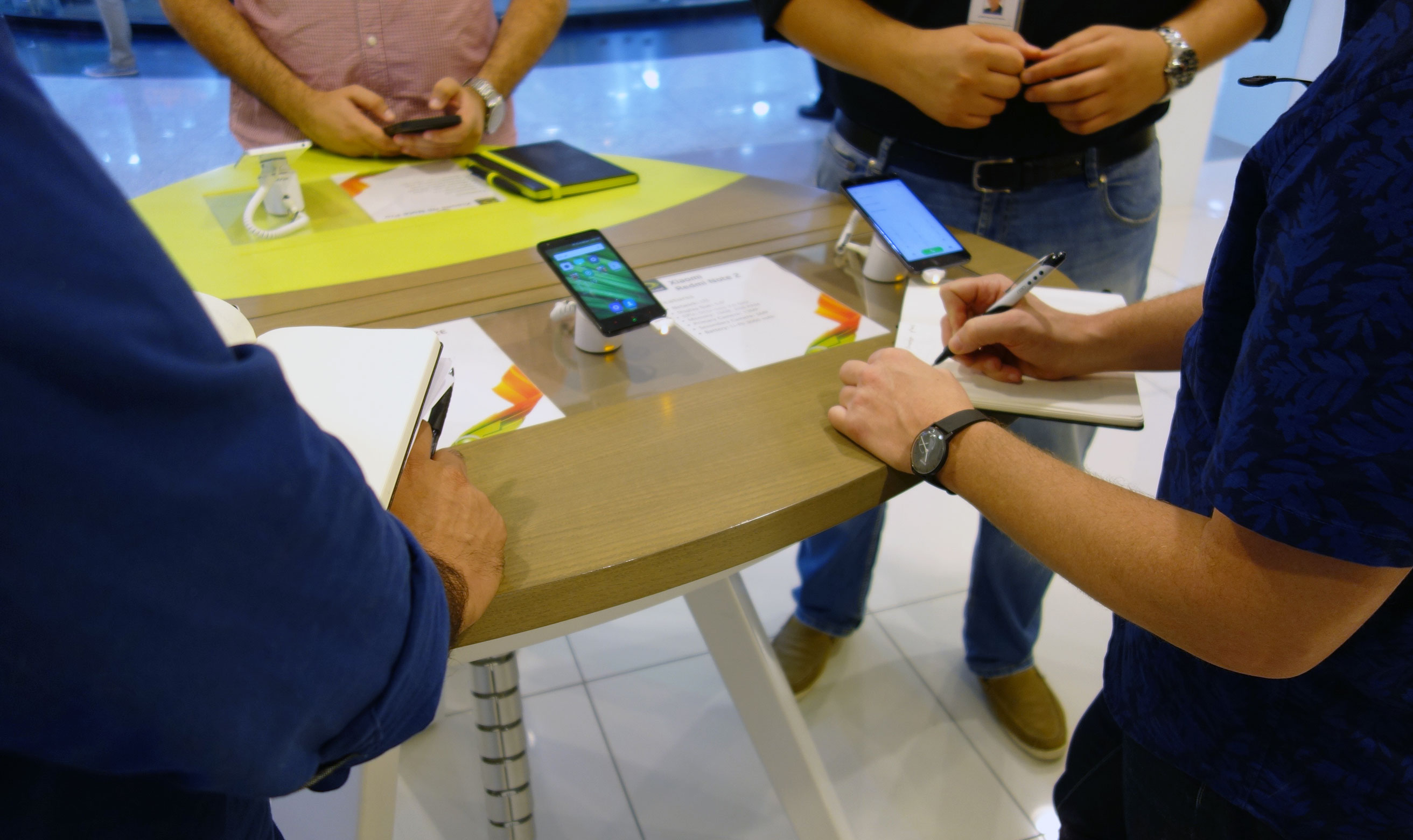
We visited 6 Etisalat stores in different areas of Dubai to observe how customers interacted with staff members and digital touchpoints, and how they spent their wait times. At each store, we spoke with staff members and store managers to understand their day-to-day tasks and how they felt about the current utilization of digital touchpoints in stores.
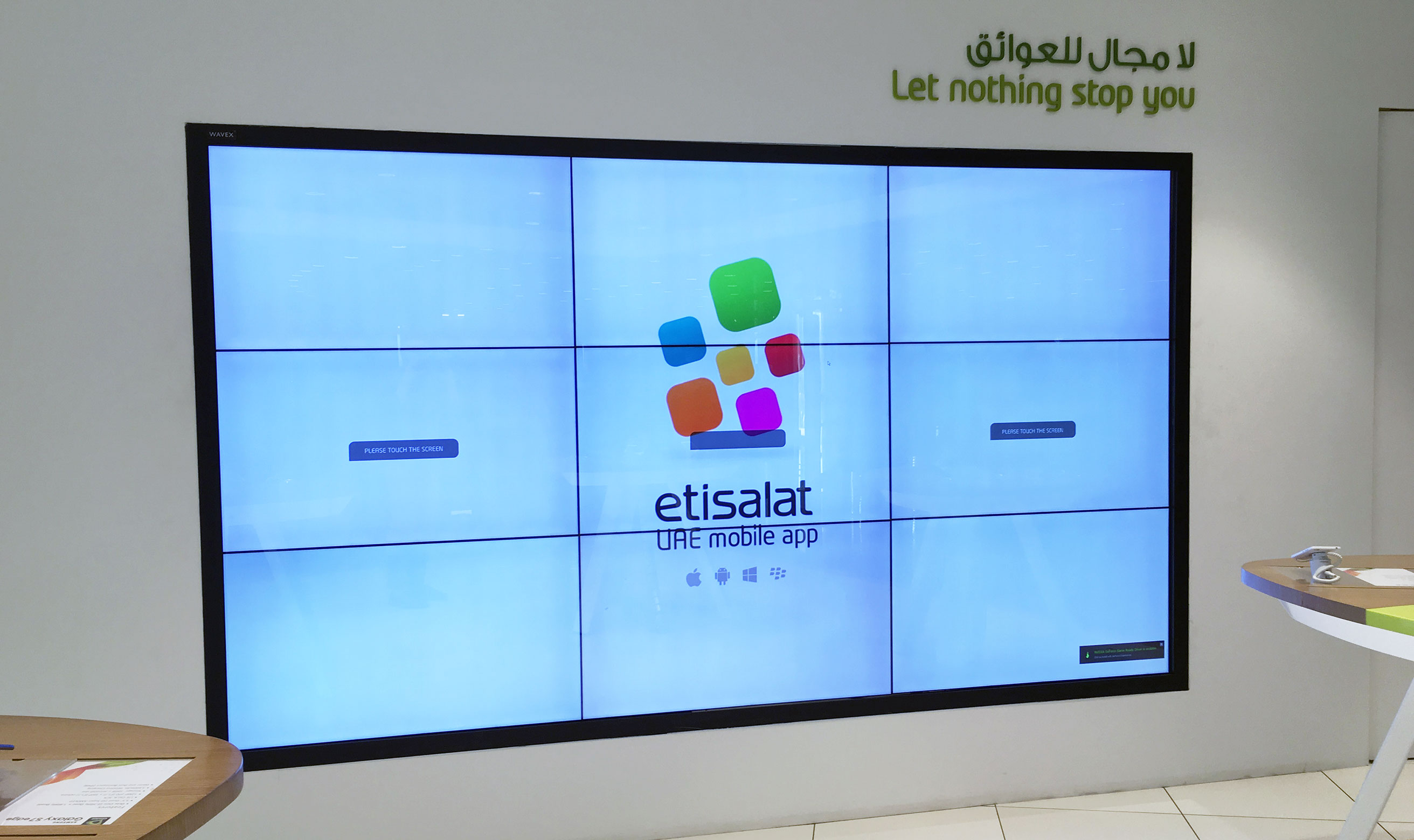
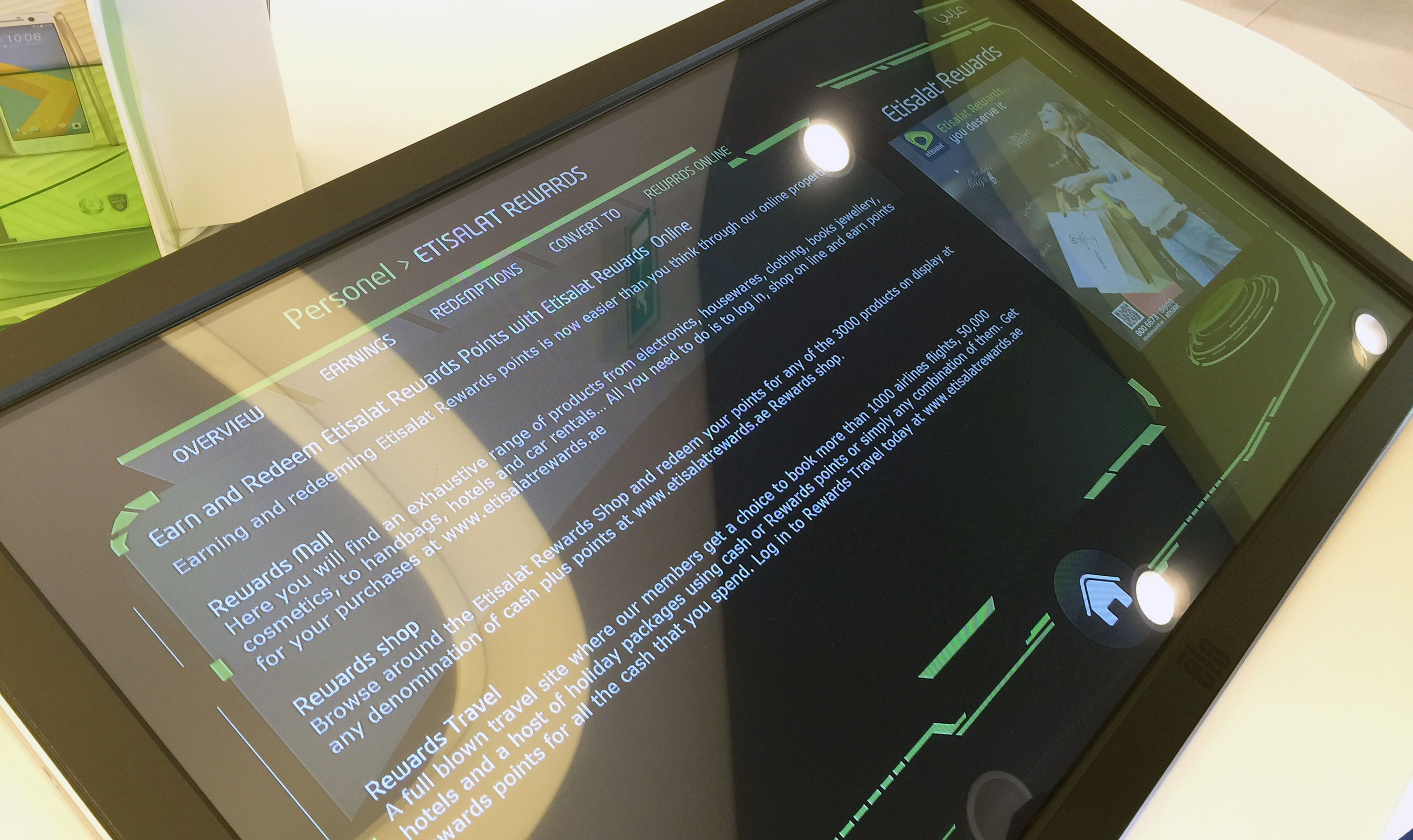
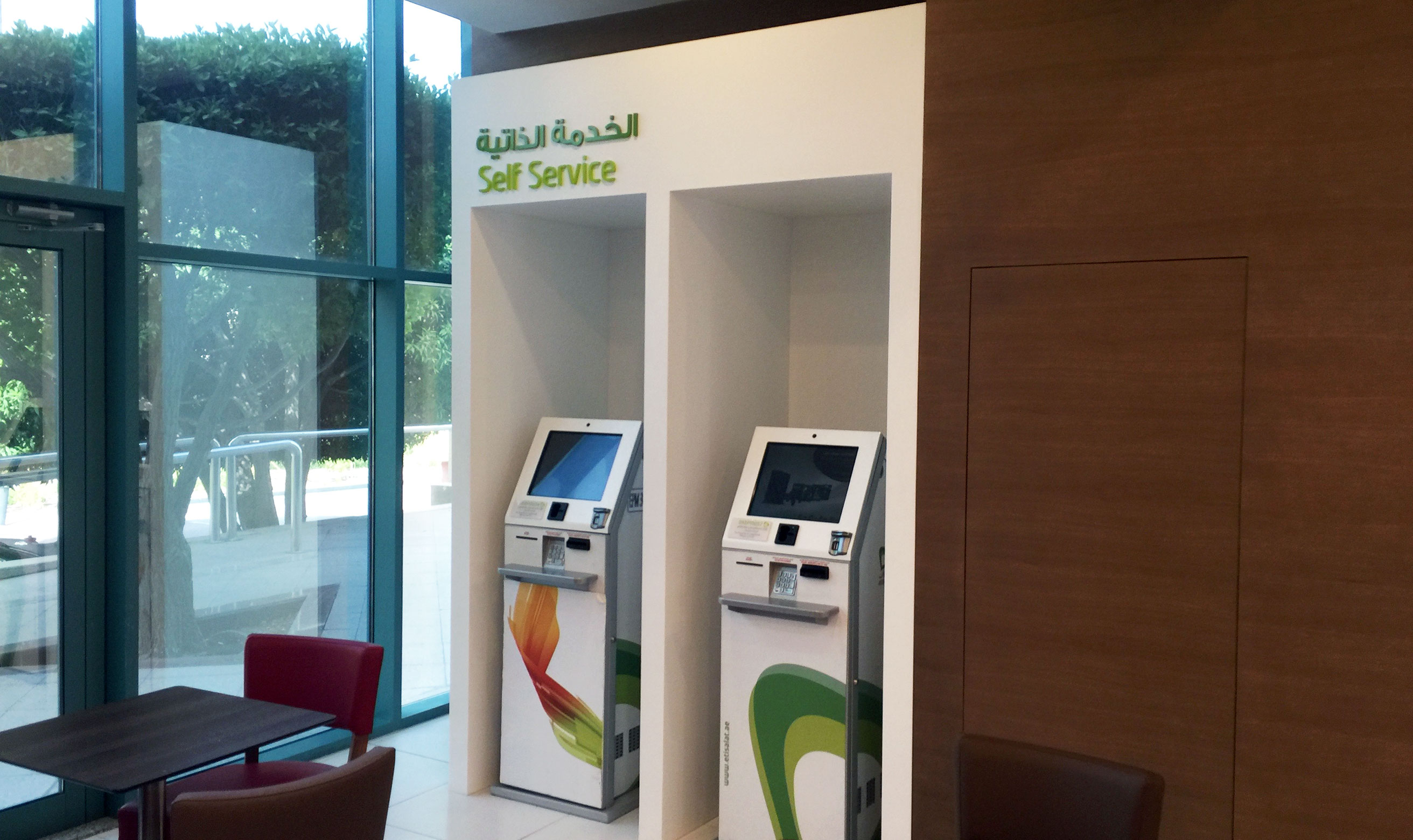
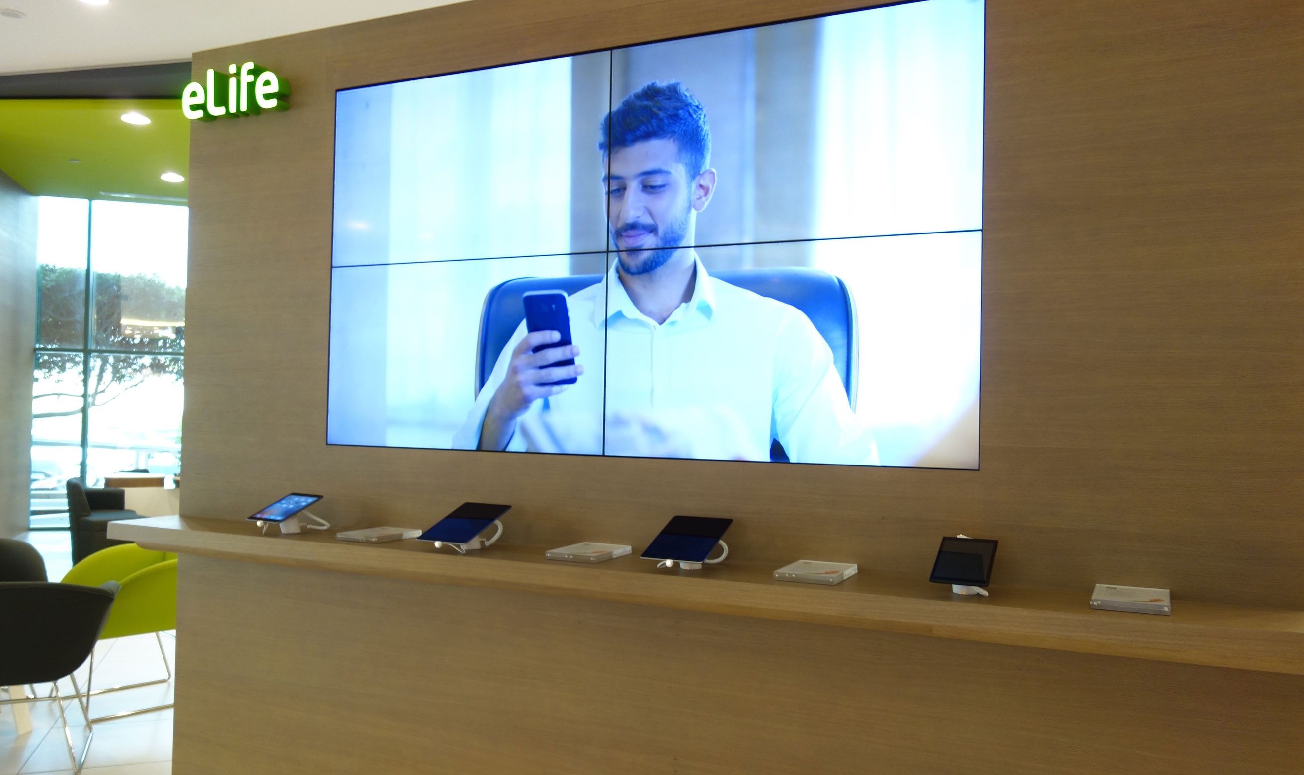
The current state of the retail digital signage experience was fragmented and undefined. Digital touchpoints were either misused or underutilized because they lacked purpose for customers and staff.
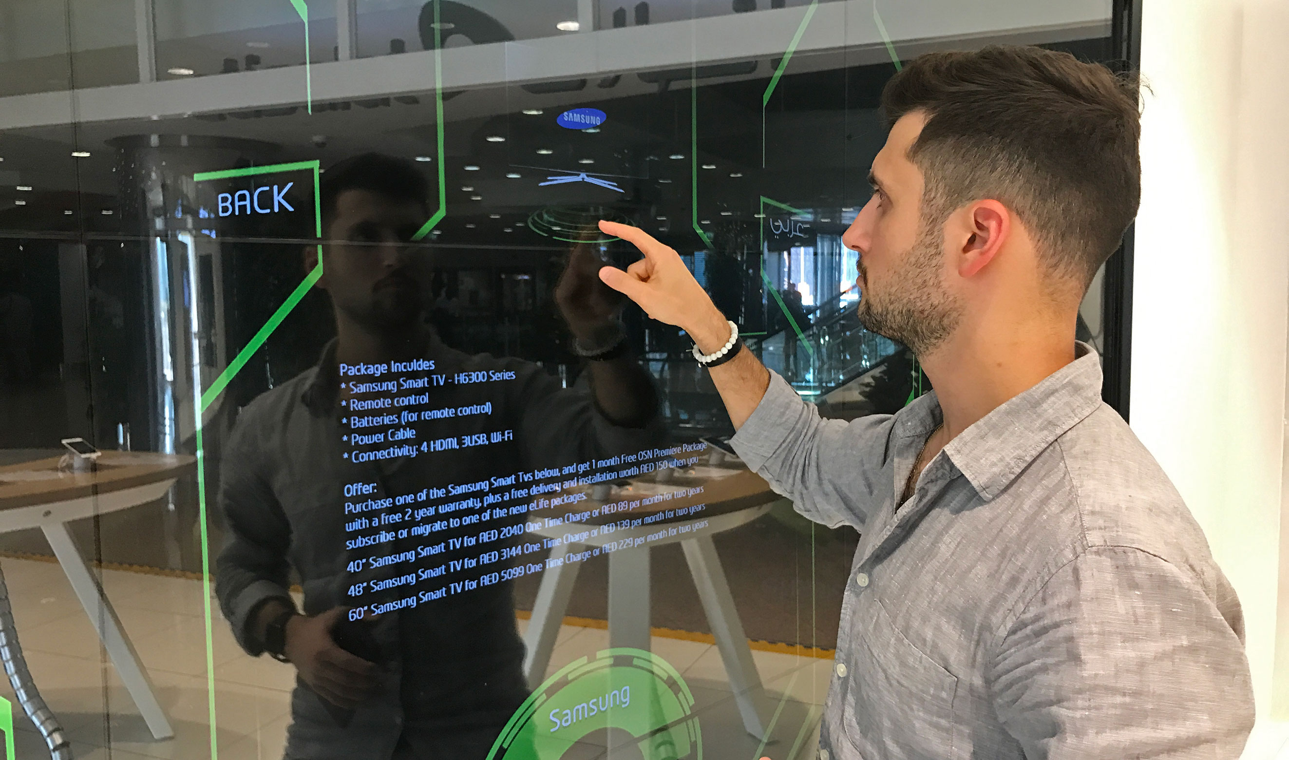
We noticed that many of the touchpoints did not have clearly defined goals and interactions were not optimized for the type of screen they appear on. Store displays and fixtures did not clearly tell customers what they could do or learn when using them. Advertising seemed to be the one content type that was optimized for screen type, distance, and time. However, our observation indicated that customers might not pay attention to due to learned “banner blindness.”
Staff members showed us how they utilized existing touchpoints — or at least tried to — in guiding customers during their visits. They mostly complained about how outdated the information about products and services was, and how slow everything felt. Some of them even found a workaround and were able to load Etisalat’s website through a hidden UI menu to show up-to-date information.
The current experience of Etisalat retail stores in Dubai highlights various touchpoints, classified into 5 groups — interactive screens, non-interactive screens, waiting area devices, Home and TV screens, and product displays.
Qualitative customer research
Designing for users in the UAE is both challenging and fun — because of how diverse the population is. Around 75% of Dubai’s population are expatriates, most of whom speak English and/or their native language. Moreover, people’s different backgrounds influence their expectations, mental models, and behaviours when using a product or service.
Our goal for customer research was to understand how people manage their relationship with Etisalat, primarily when it came to visiting the stores. Why do they visit them in the first place? How do they spend their wait times? Do they prefer to be guided by employees or be left alone? These were some of the research questions we wanted to answer.
Understanding Etisalat’s user base helped us recruit the right number of customers that covered different demographics and use cases. In addition, having Arabic speaking team members allowed us to conduct interviews with local Emiratis and better connect with them.
“What do I do when I have to wait for 15-plus minutes? Use my phone to kill time!”
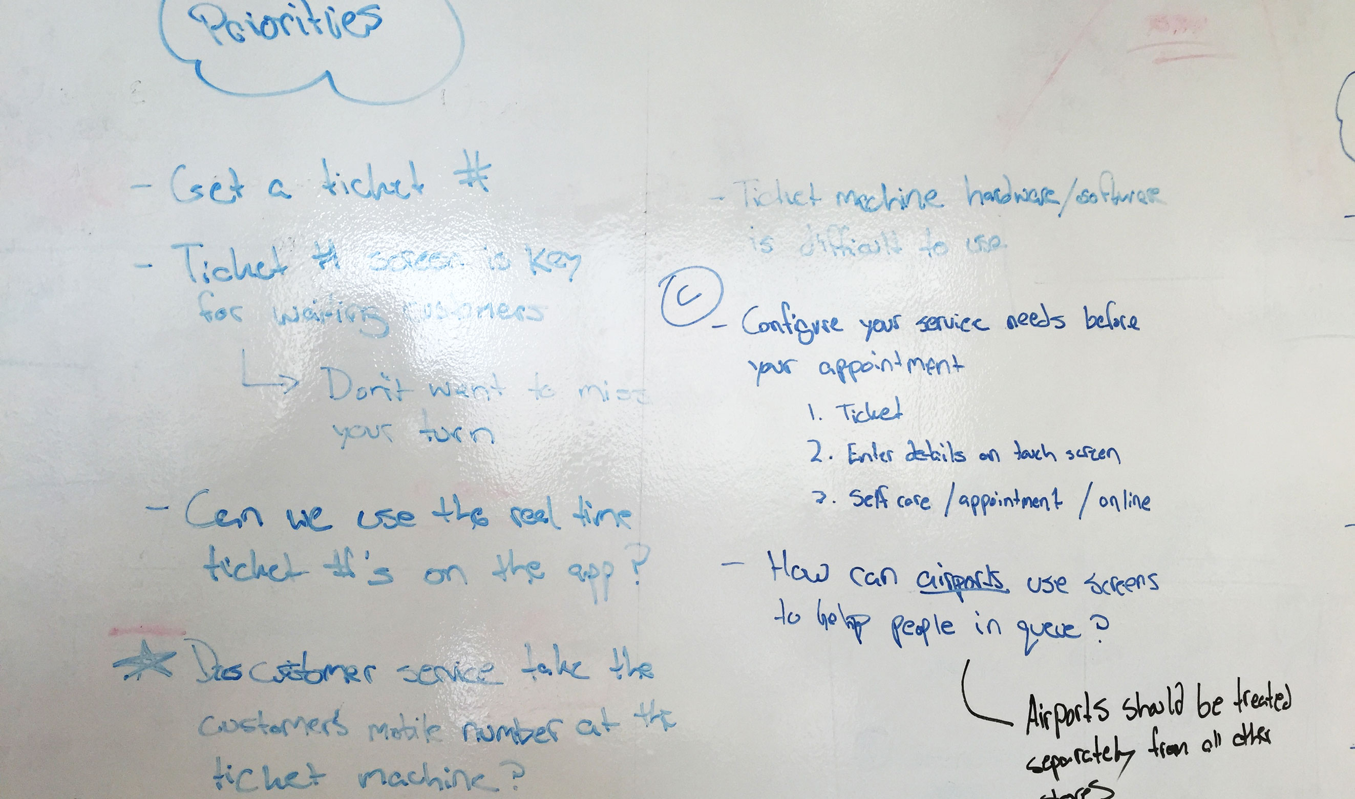
During their visits, customers started by taking a ticket and then sat in the waiting area until their appointment. They were not guided to store experiences, and it was not clear that most touch screens were interactive. Customers always asked about the differences between devices because clear descriptions were lacking.
During busy times, customers who were waiting for their turn resorted to different ways of killing time — primarily, using their mobile phones. We noticed that several customers used iPads in the waiting area to watch videos and play video games. Others took selfies when exploring demo devices.
Analysis & Strategy
In that phase, we focused on 3 things — highlighting research trends, presenting experience concepts, and defining the strategy for the future of Etisalat’s retail digital signage experience.
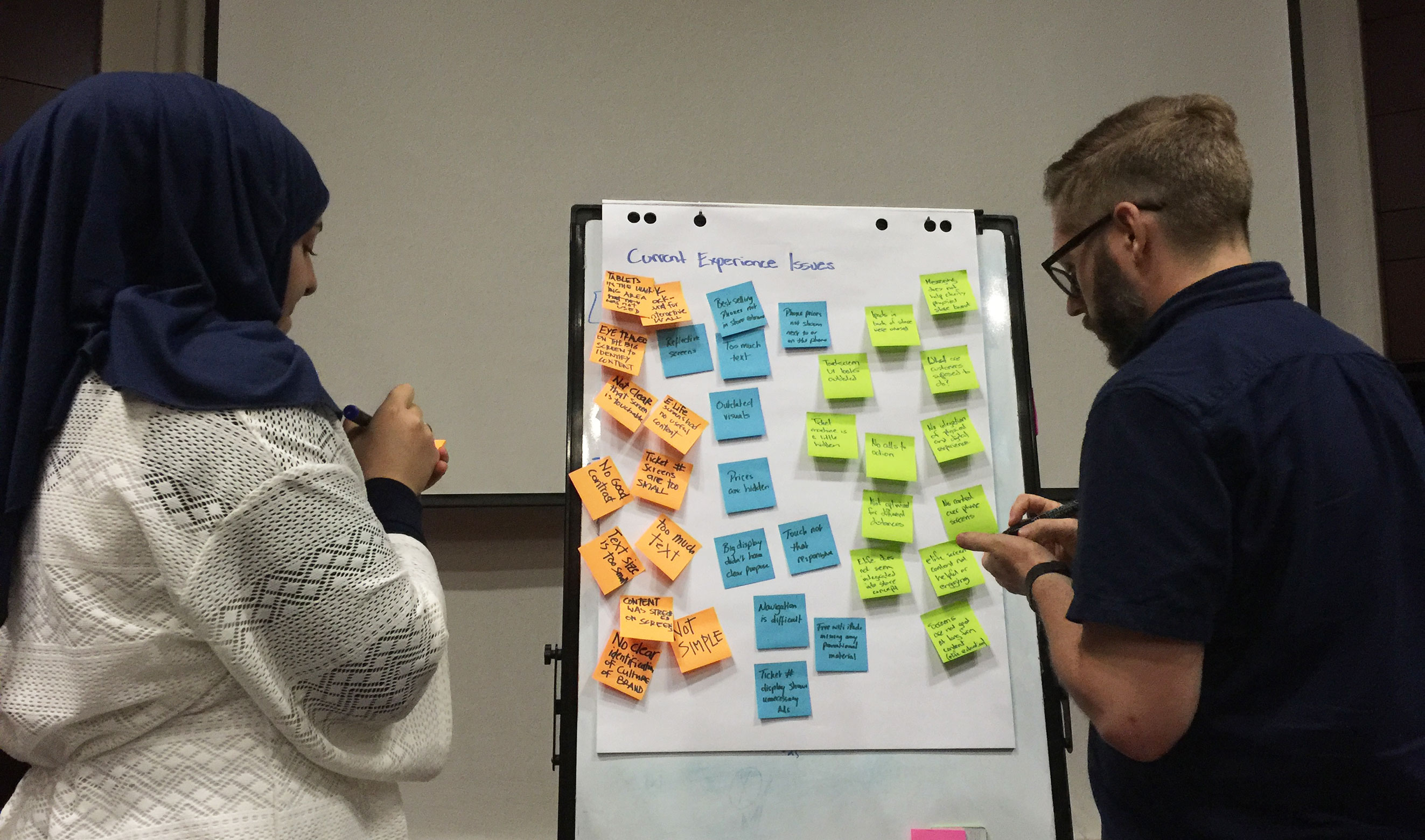
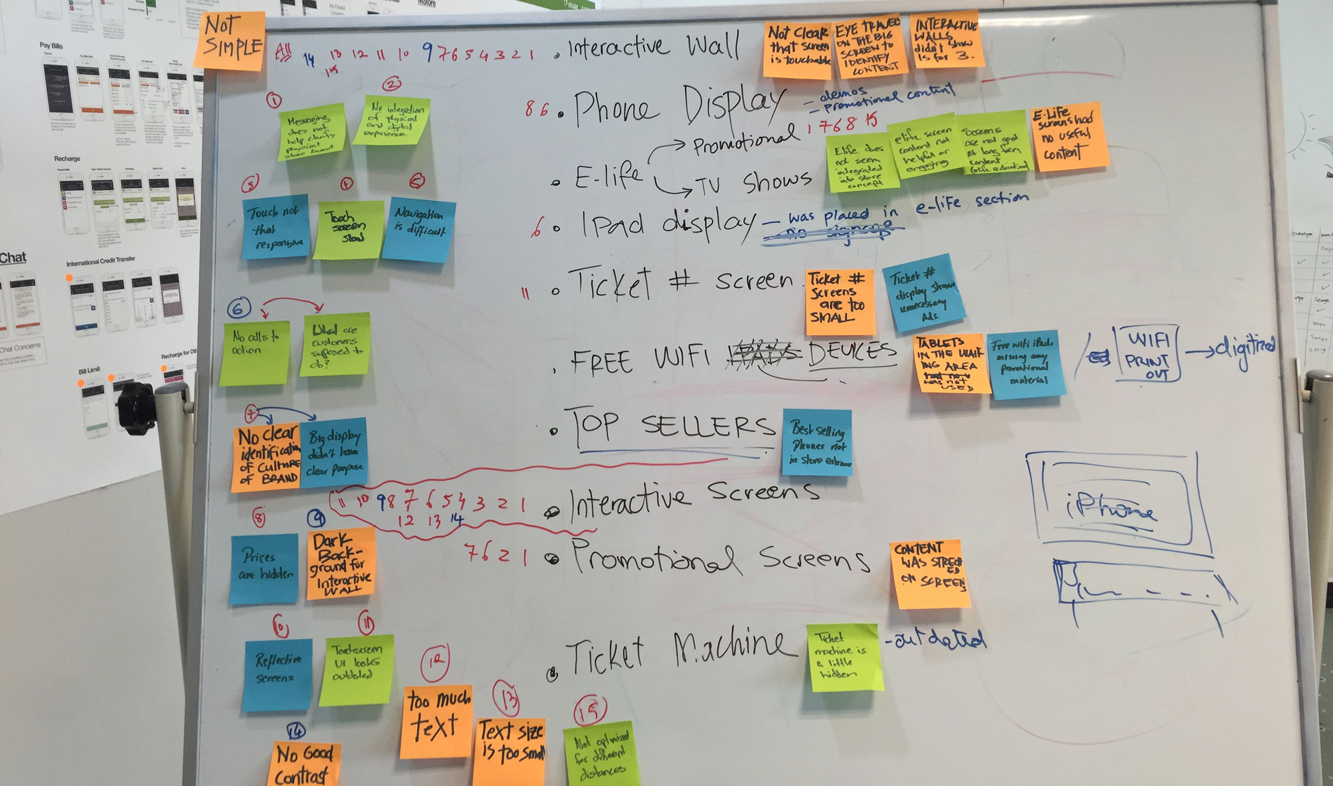
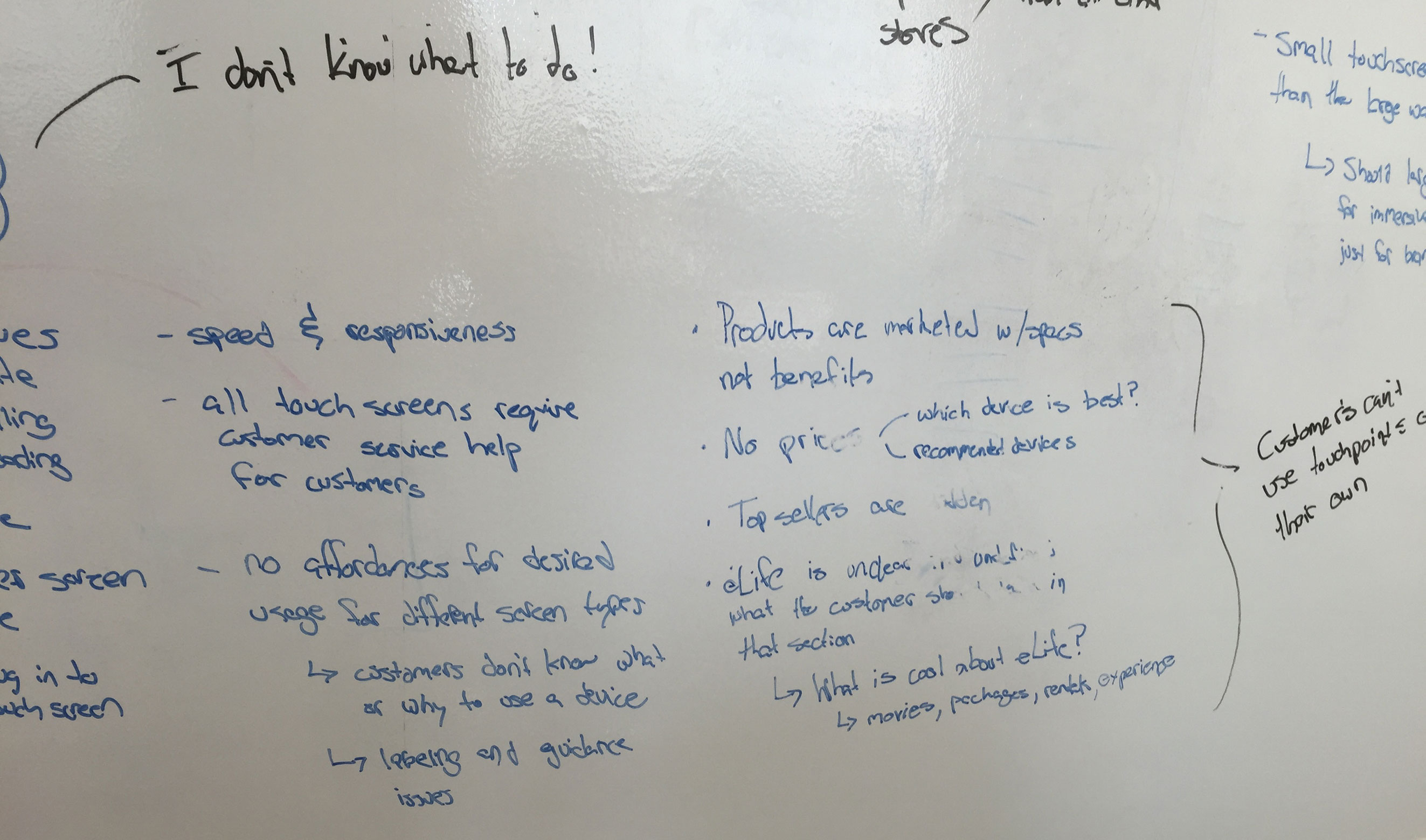
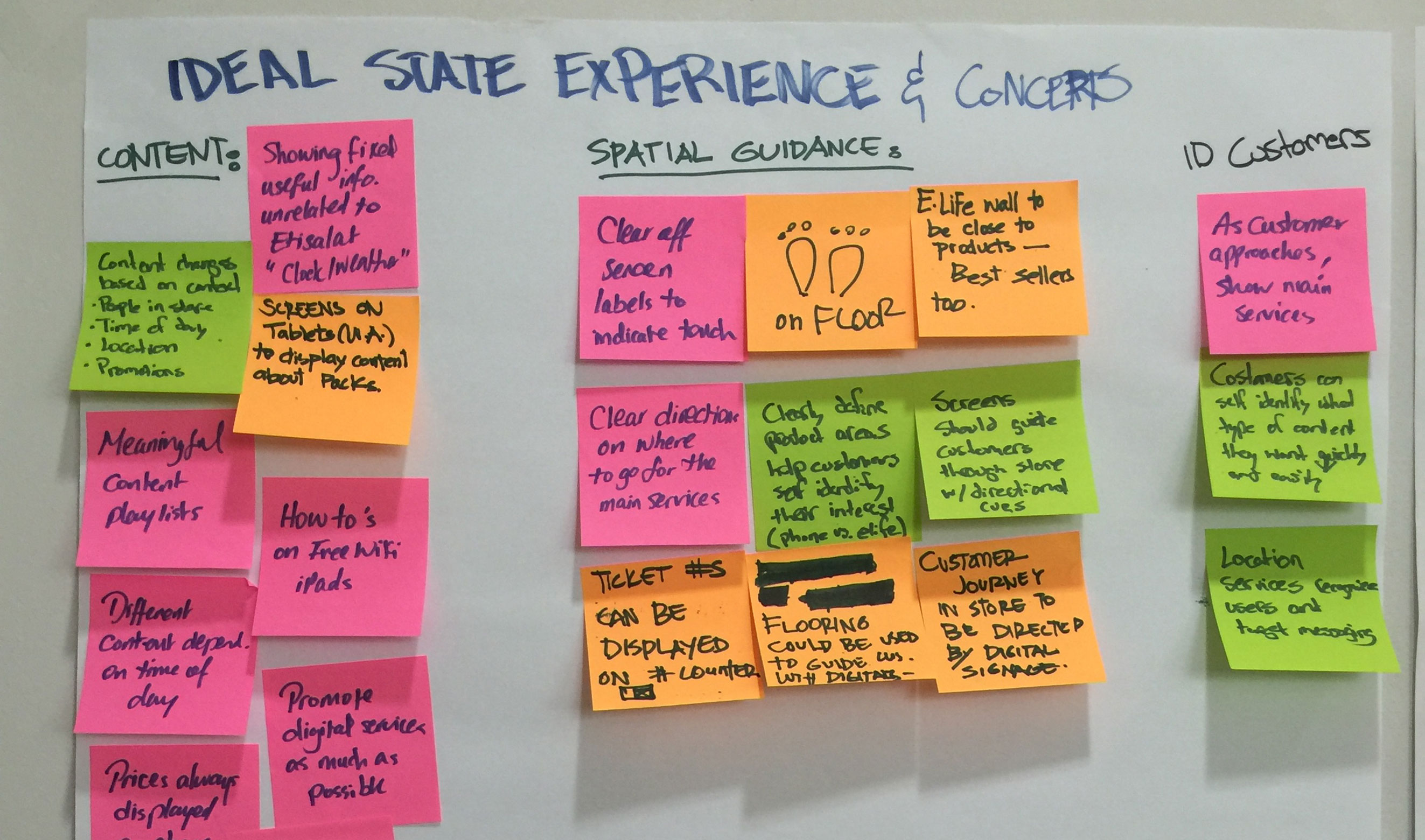
We summarized our research insights into 6 trends, presenting core problems that the experience mostly suffered from, and pain-points expressed by customers and staff members. With each trend, we identified opportunities that could be leveraged to create a more engaging experience that better serves Etisalat customers and supports business goals.
Guiding customers, empowering employees, and minimizing wait times, were the top trends we identified in our research.
Making sense of our observations and interviews to create insights and then ideate on possible solutions and concepts.
Using experience levers to tune the service
In our early inspiration phase, we noticed that digital signage experiences were guided by “functional” and “emotional” levers. Those key experience traits could be used to tune a digital service based on the type of customers interacting with the brand and business goals and objectives.
In terms of function, experiences that were guided provided simple navigation, curated content, and were linear and efficient. Exploratory interfaces were more engaging and reactive, providing diverse content in a non-linear fashion.
In terms of look and feel, experiences were either buttoned-down (formal, traditional, to the point, quiet) or playful (expressive, imaginative, loud, social).
Tractor Beam — a guided and playful service concept
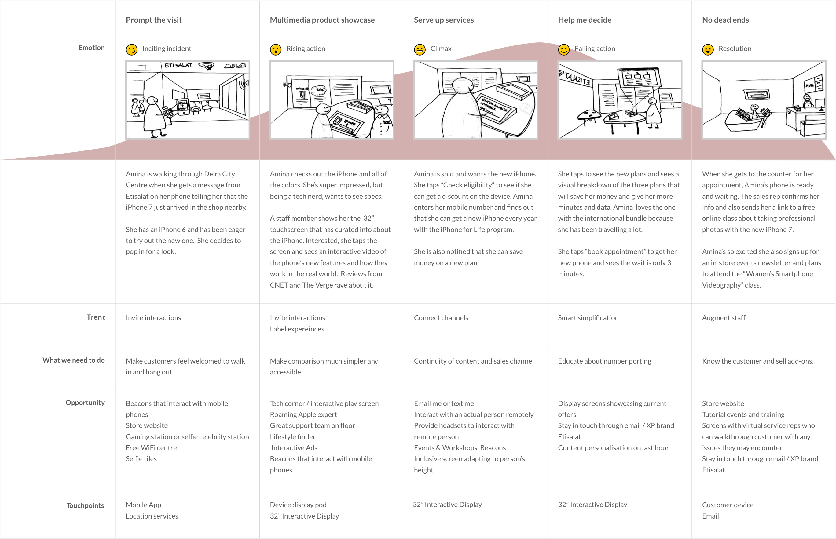
The existing Etisalat experience was buttoned-down and guided. We wanted to move it into new areas through our ideas that are tuned by the design levers we set earlier. We came up with 3 concepts that highlight the journey of a customer and defined the store approach that better serves and engages them.
Etisalat stakeholders chose a concept that leverages a collection of tools across touchpoints to guide customers, and help them unpack the complexity of telecom services to make smart decisions.
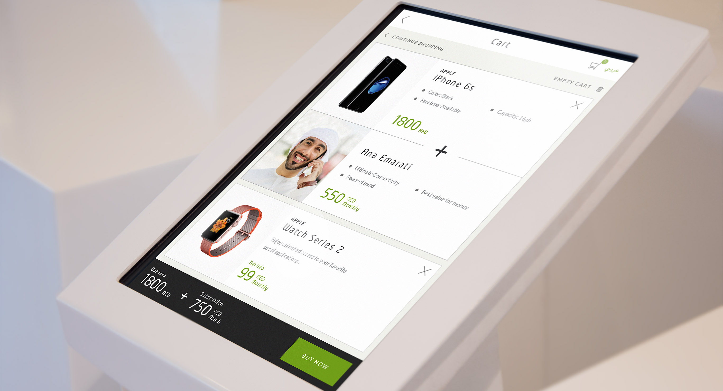
To demonstrate our concept, we created a persona called Amina, a representation of an Etisalat postpaid customer who’s obsessed with tech. She is always advising her friends on which computer, TV, or phone to get when they’re making a purchase. Amina uses Etisalat because she likes better coverage, and there’s a store near her house. She also likes upgrading her iPhone every year to be on the bleeding edge of technology.
The strategic vision for digital signage in Etisalat retail shops was predicated on a shift towards a more guided and playful experience — which Etisalat customers and stakeholders were asking for.
Defining staff journeys to better guide the customer
Staff journeys outlined how we envisioned strategically placing Etisalat staff at key points throughout the user’s in-store journey. The vision was to empower staff so that they can guide and support the customer through their journey and make their in-store experience as seamless as possible. Their role would also supplement the information on digital touchpoints.
Proposing a different strategy for each touchpoint
The majority of Etisalat stores had up to 7 digital touchpoints; therefore, a plan for each was essential to ensure our vision was executed to its full potential. Every touchpoint strategy covered goals, opportunities, features, content approach, and calls-to-action.
Products still led the in-store experience; however, they were enveloped in fun experiences that help customers learn more about the devices and configure them to their needs. Etisalat services, on the other hand, were featured in select areas where customers can see benefits or dive deep into all of the options and configurations.
Design
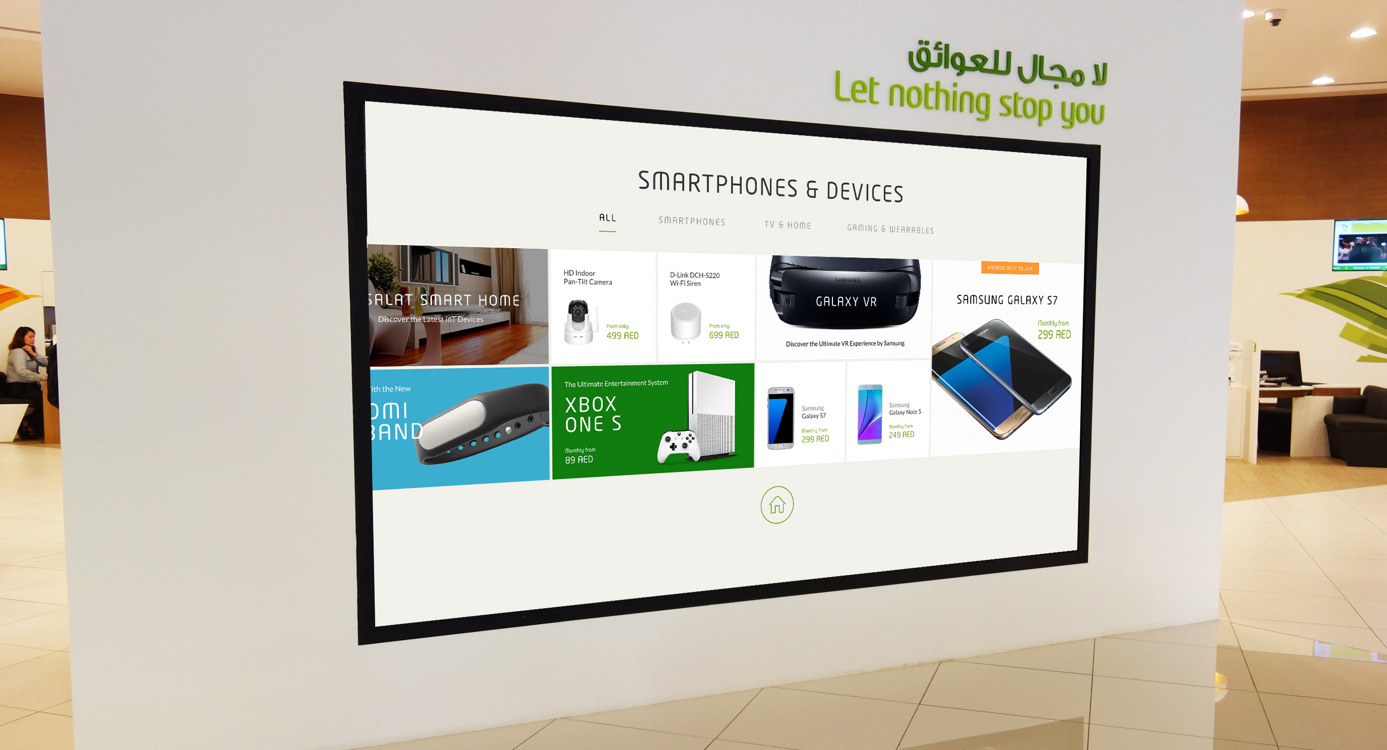
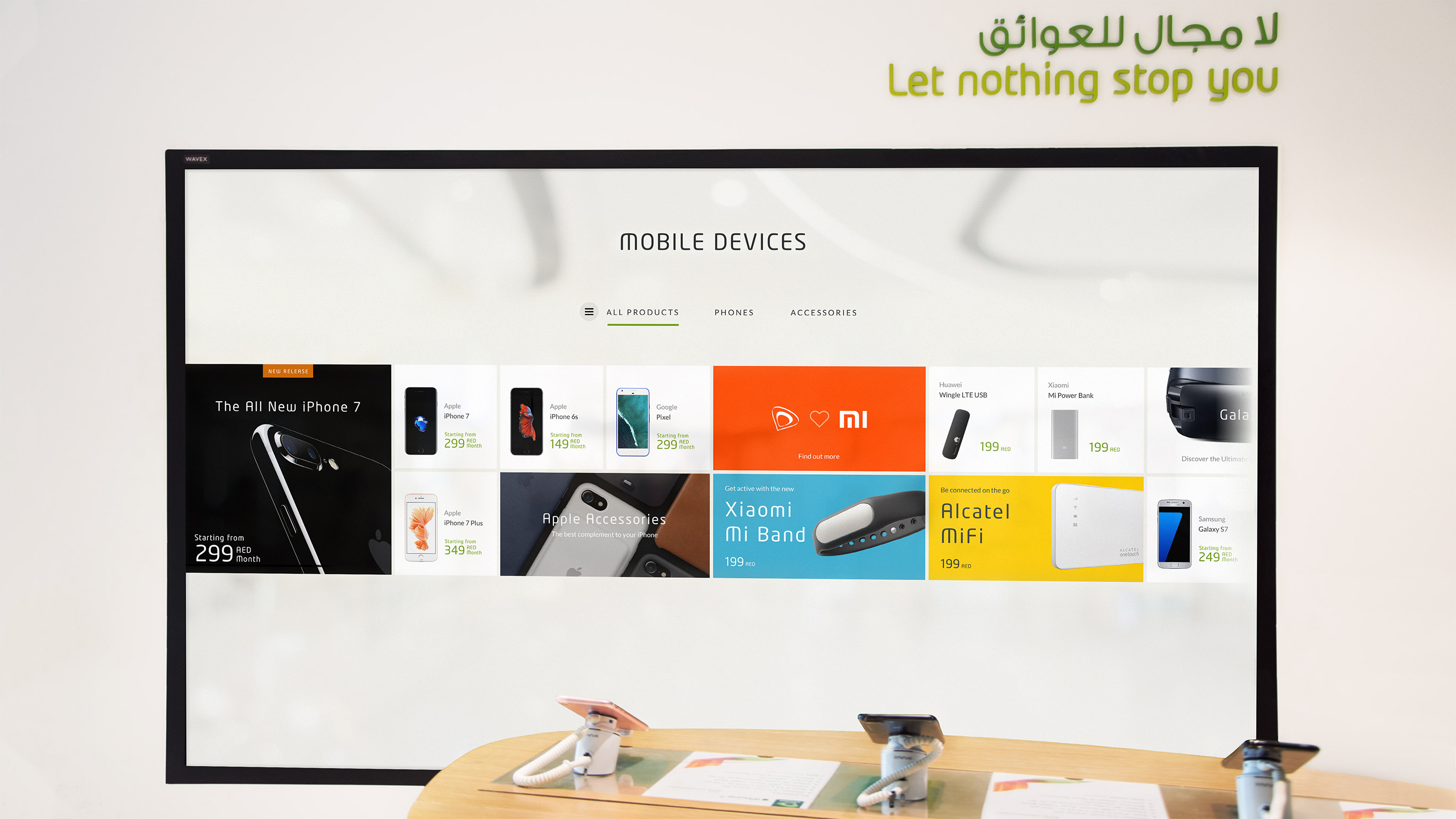
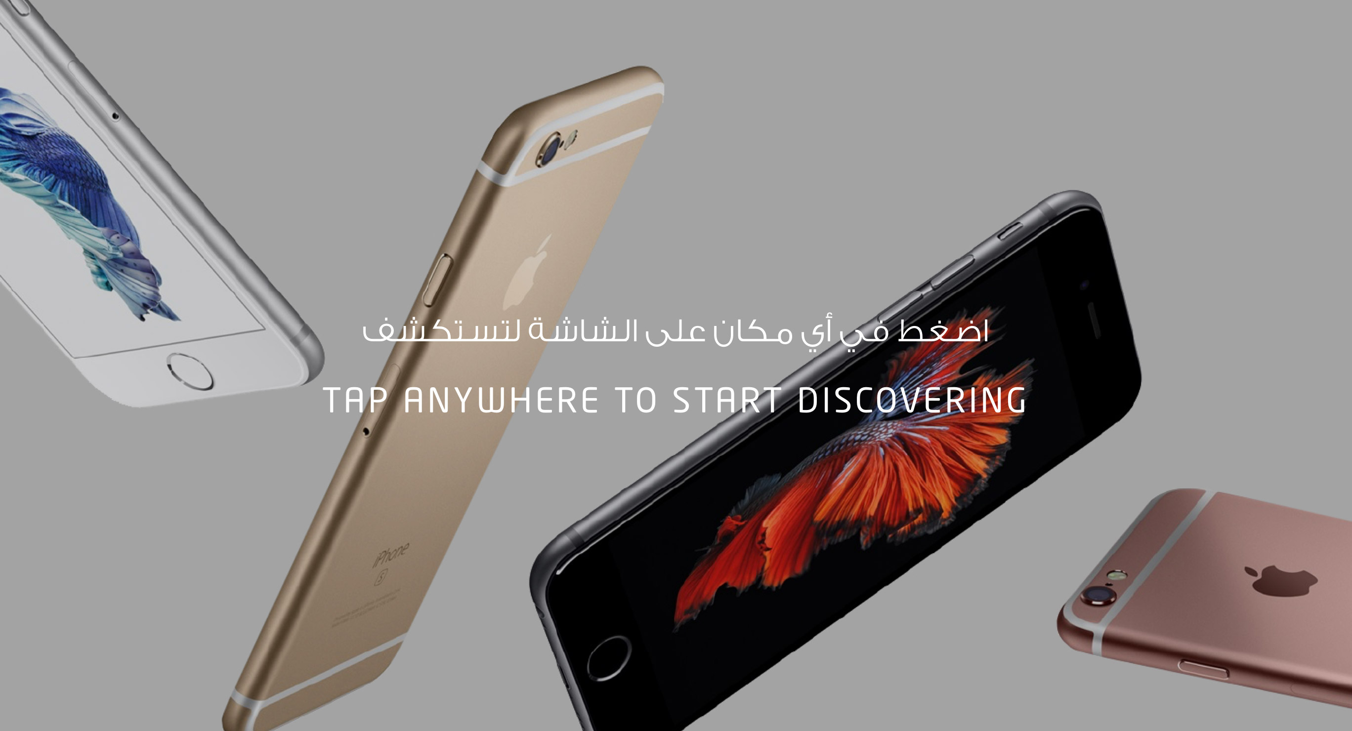
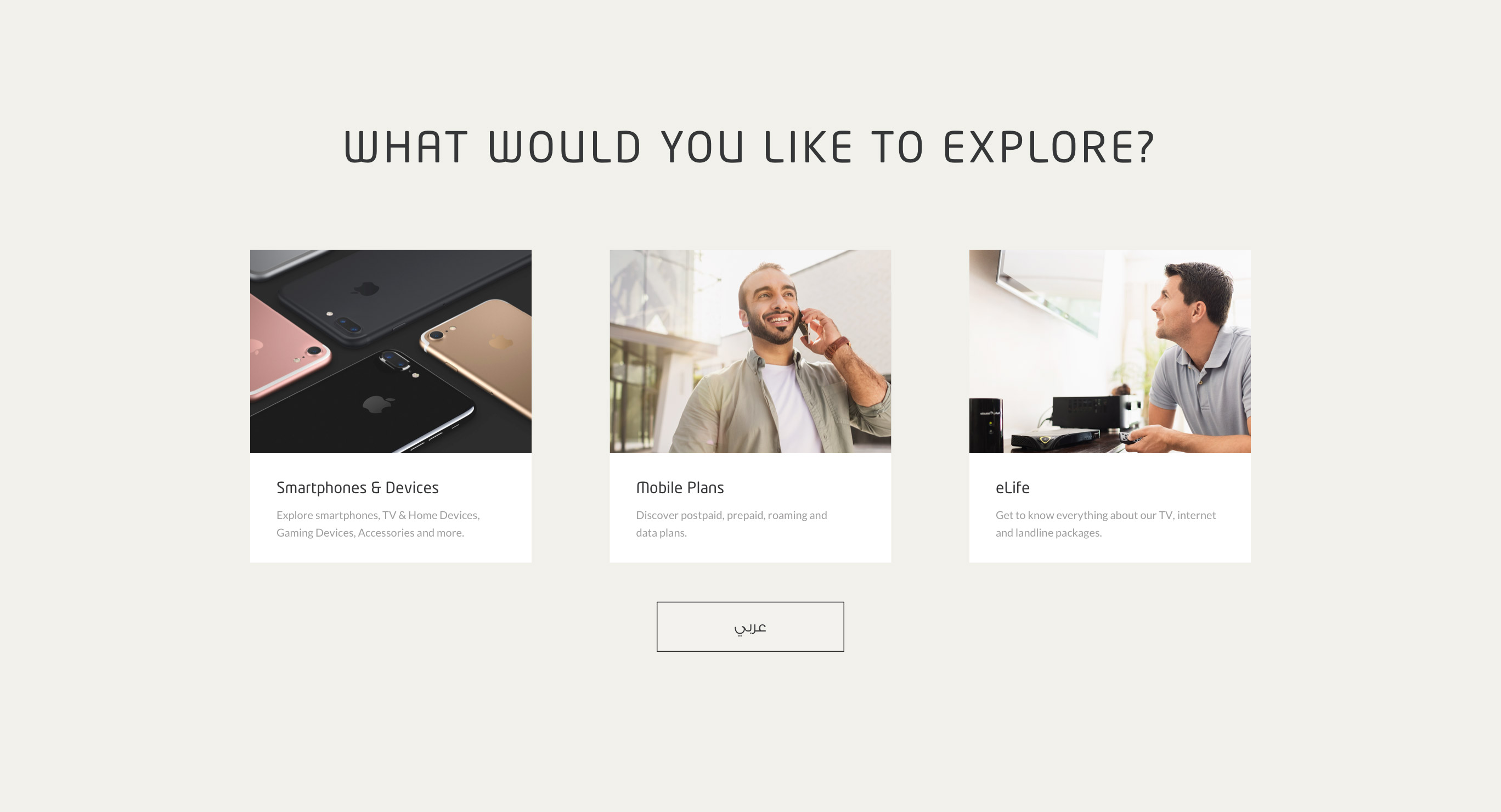
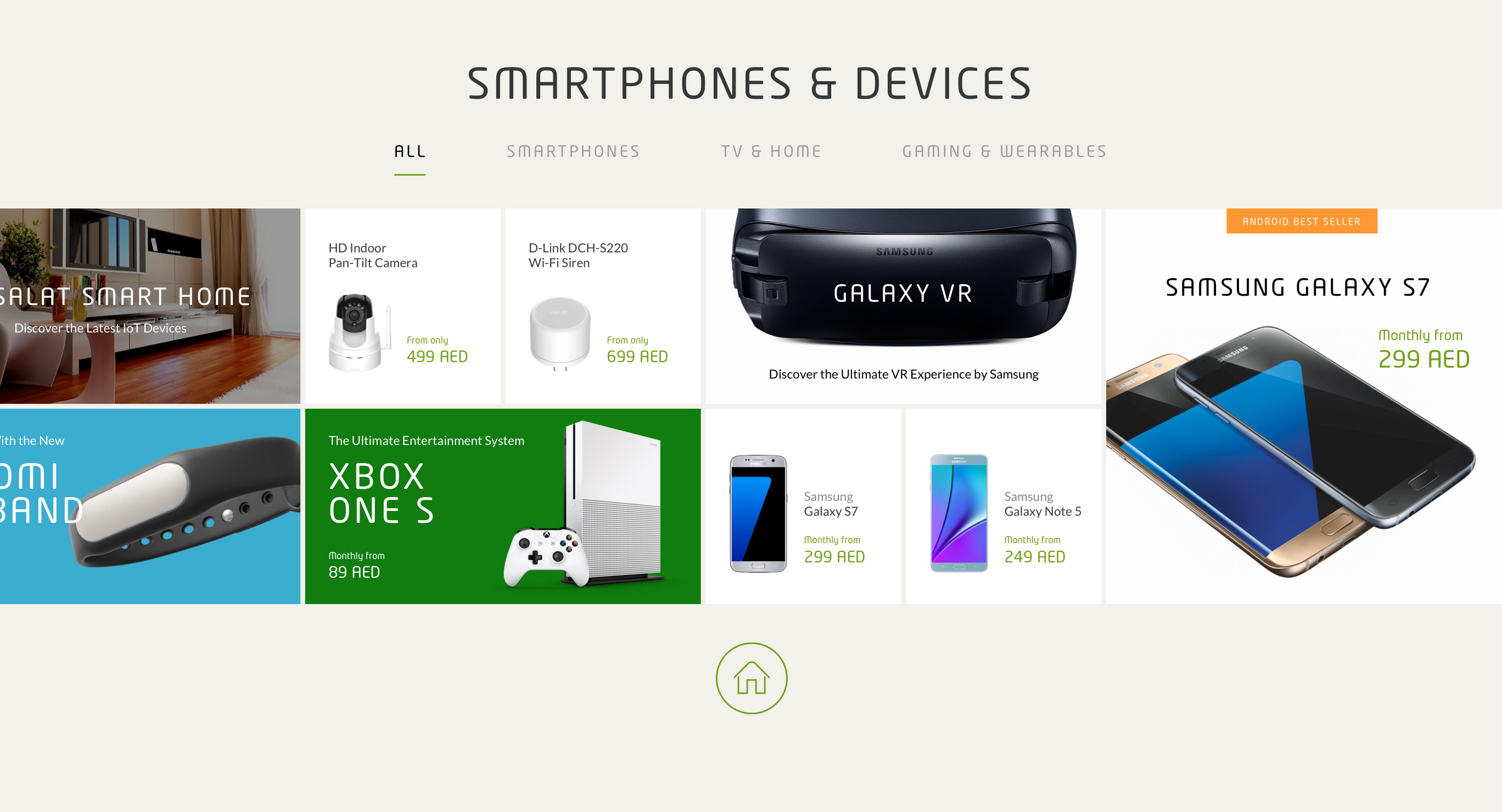
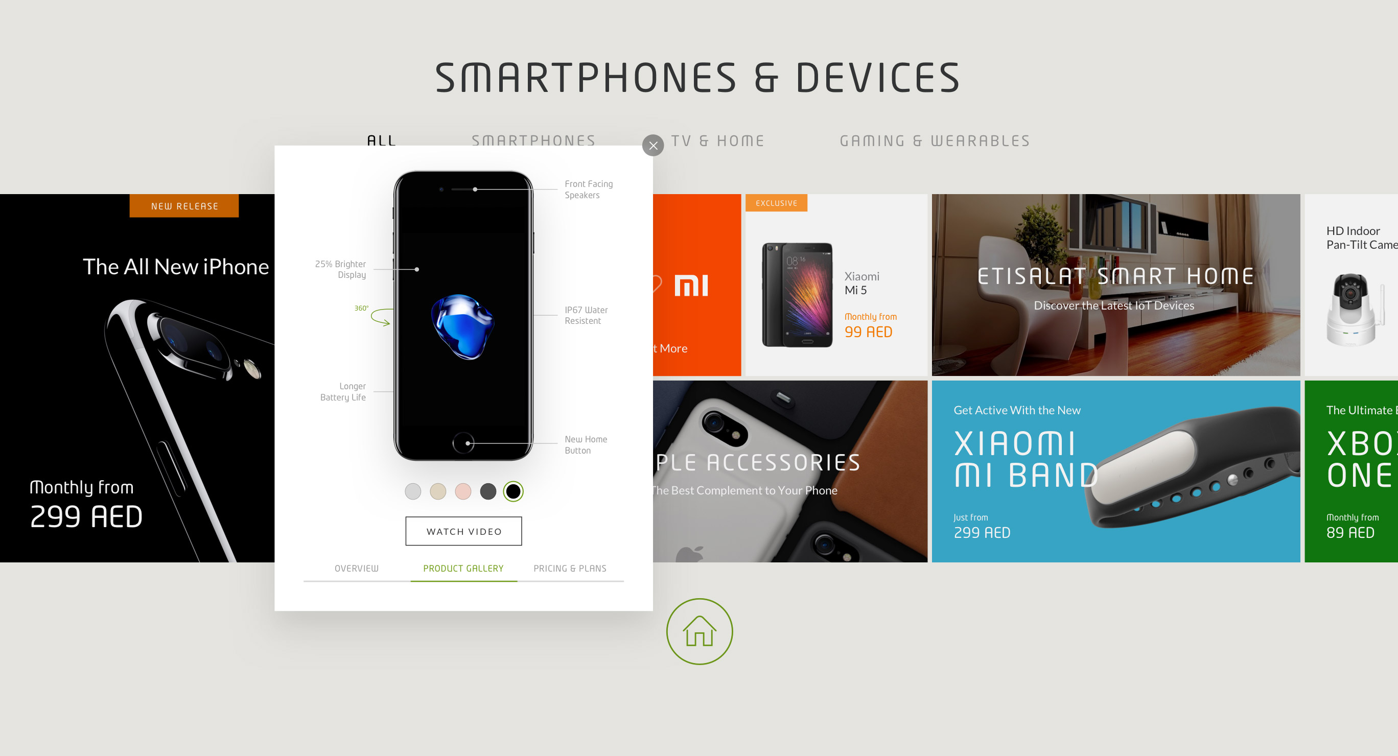
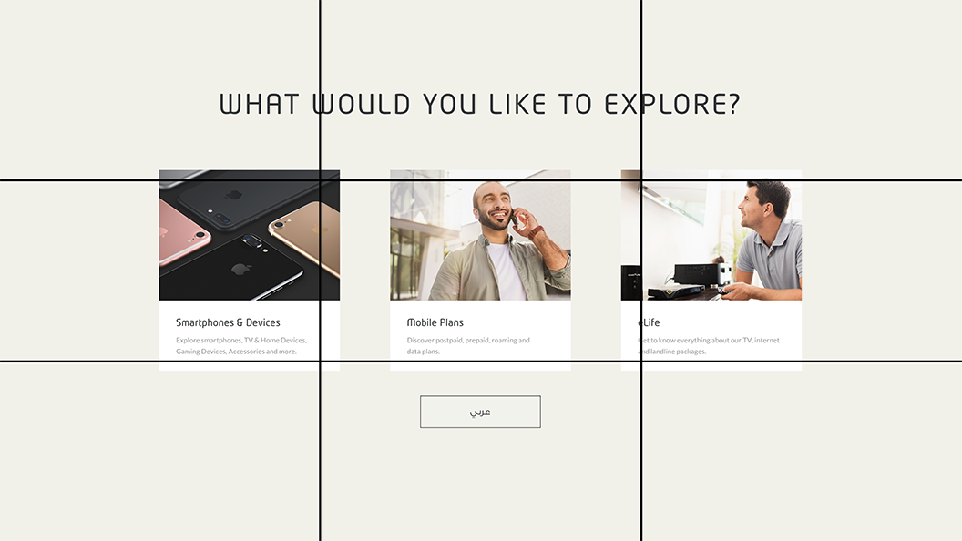
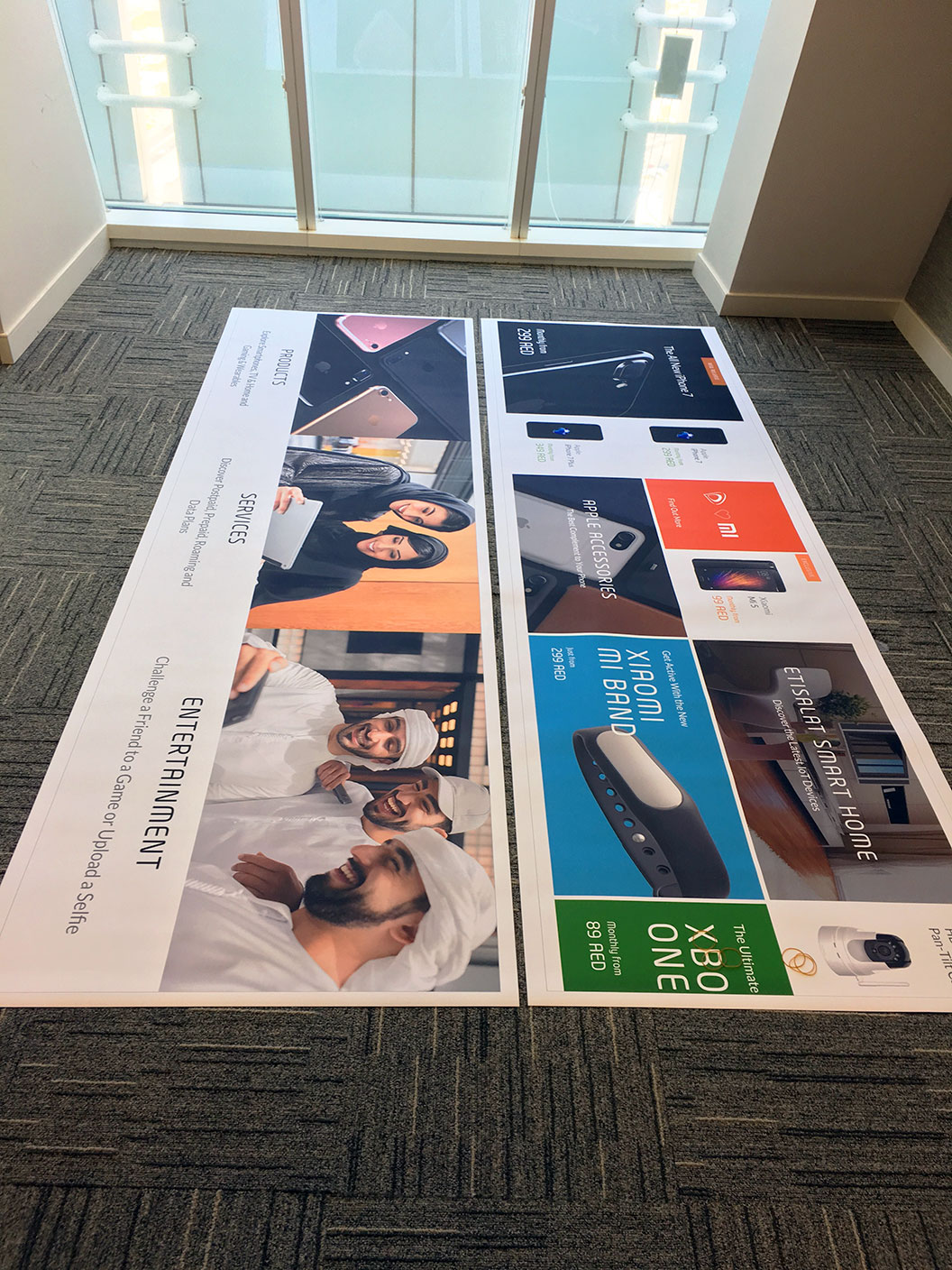
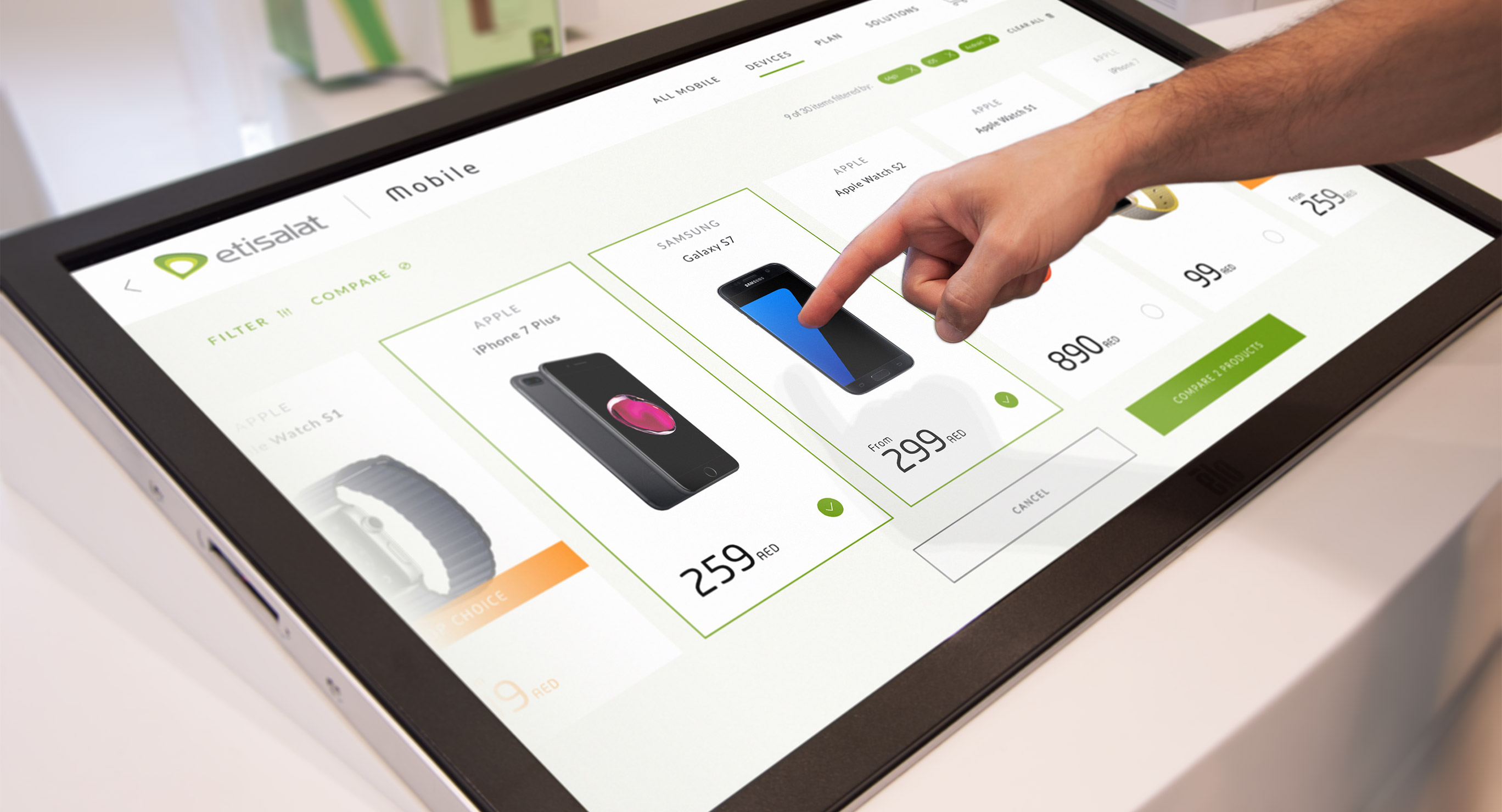
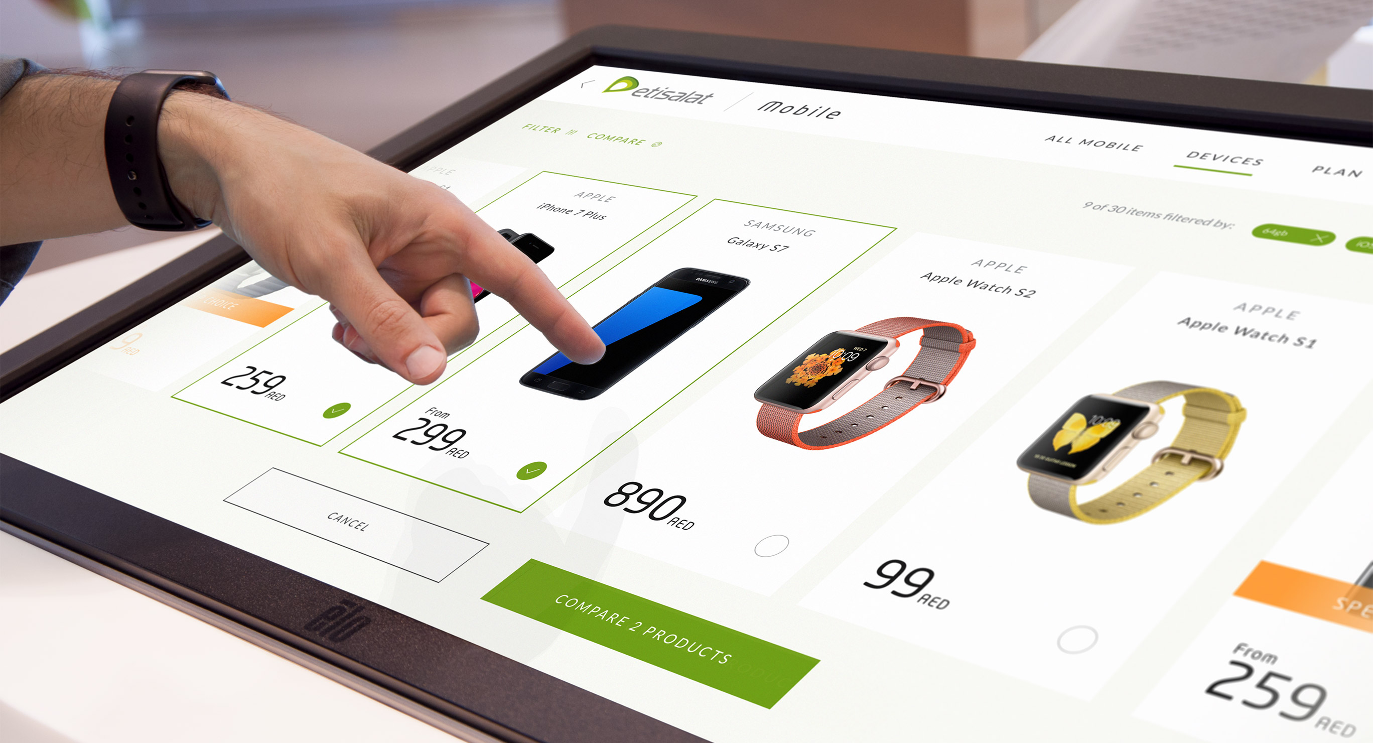
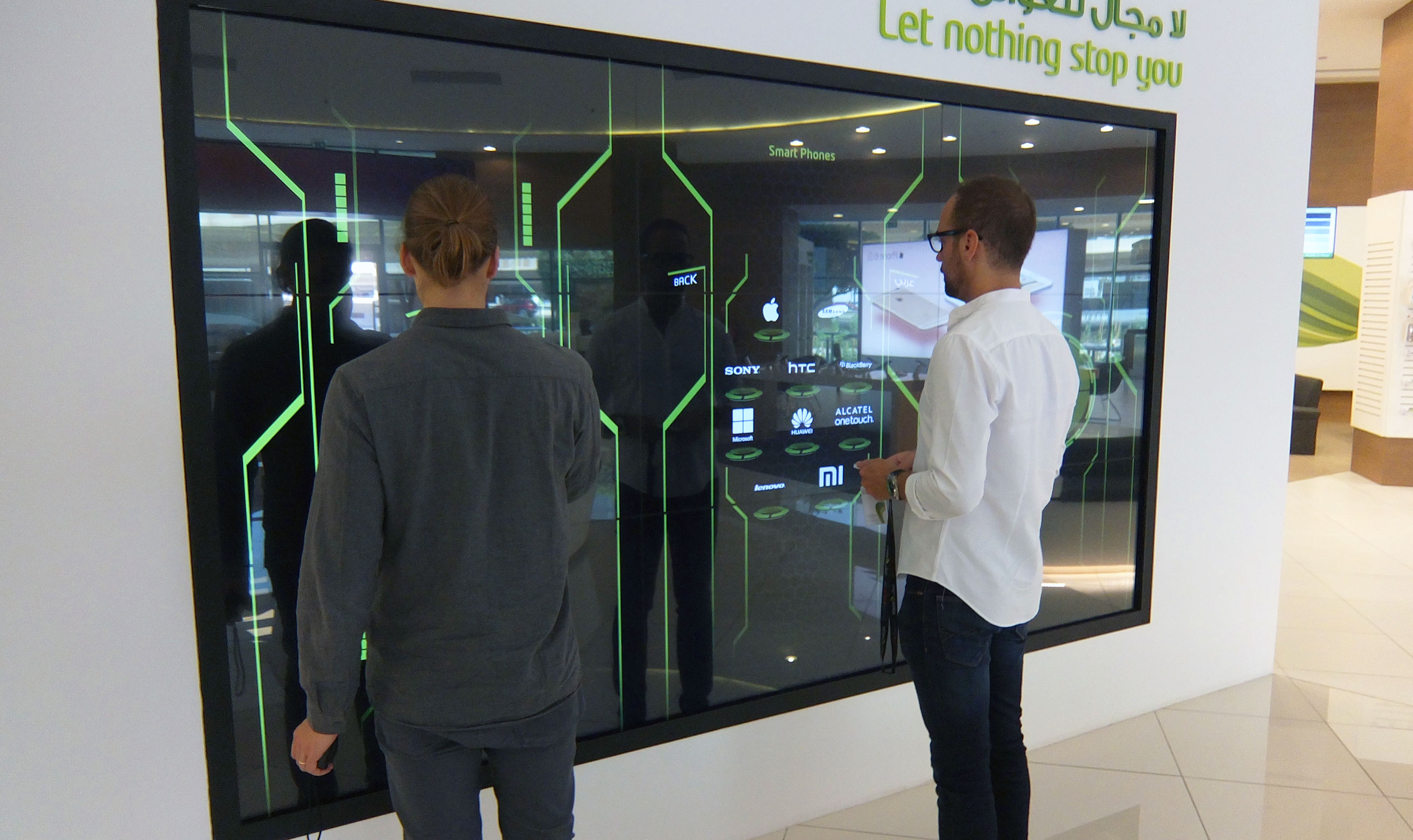
Our design study focused on the biggest and most prominent touch screen in the store — we called it The Touch Wall. It demonstrates a quick product discovery journey of a customer who is looking to purchase a new smartphone. The customer uses The Touch Wall to help them make a purchase decision, guided by a staff member.
The Touch Wall
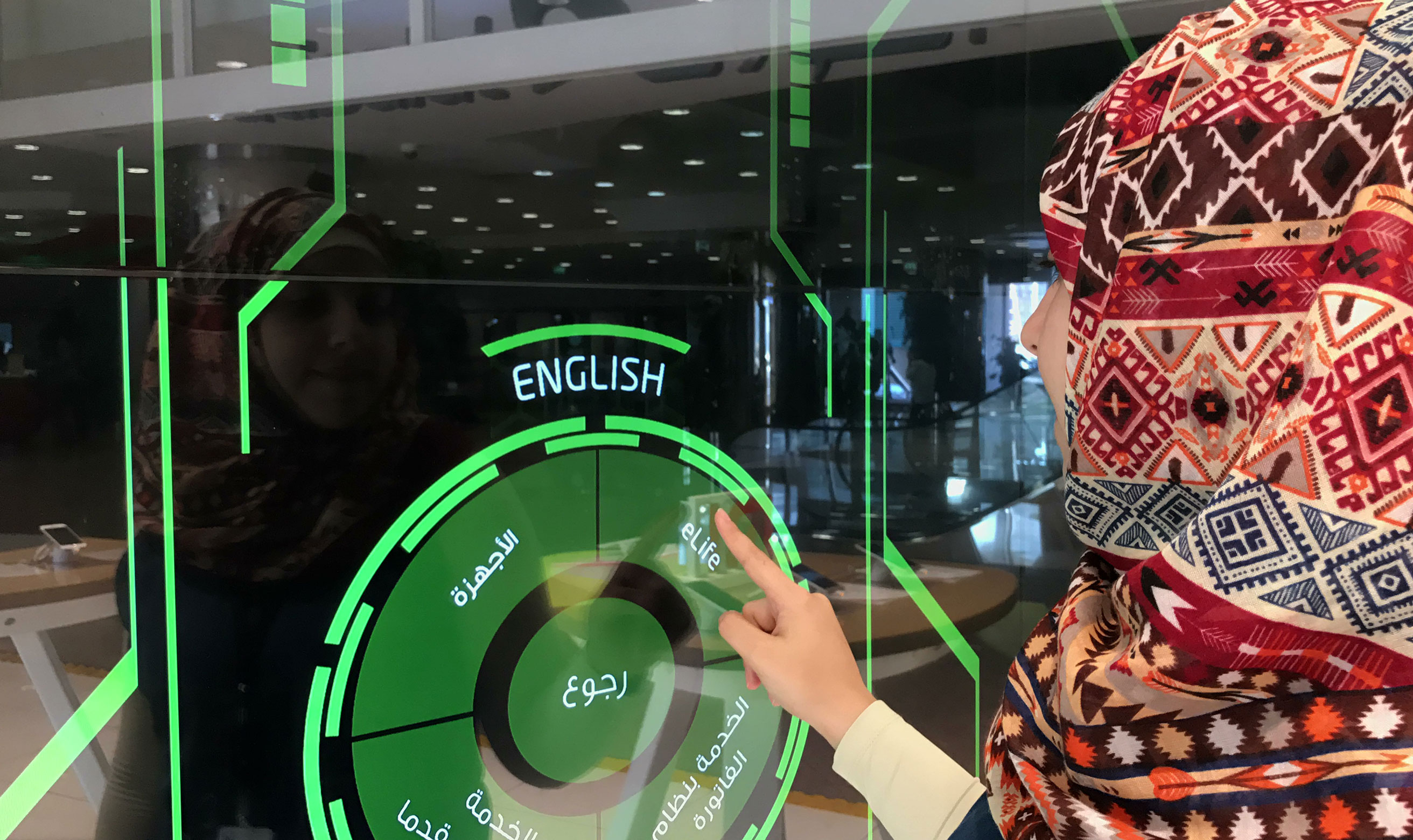
The massive 120-plus inch touchscreen was the centrepiece of our digital signage strategy. It sets customer expectations for the digital experiences that follow as they explore touchpoints throughout the store at their own pace.
The primary goal of the large touchscreen focused on quick, bite-sized, experiential product and service overviews in a fun and engaging way. Other uses focused on customer engagement through campaign advertising and entertainment features.
Challenges
When I started designing The Wall experience, I was faced with the challenge of not being able to mirror my designs on the screen because of technical limitations in the stores. It was also impossible to conduct usability testing because of lacking context for end users. So, I had to improvise.
Future Iterations
After Etisalat’s stakeholders well-received our design concept, we were allowed to start Phase 2 and execute our touchpoint strategy that extended to all touchpoints. We followed an iterative design process that relied on prototyping and usability testing. I was able to contribute at different times throughout the project lifecycle, primarily on visual design-related tasks, in addition to continuously integrating design components into Etisalat’s design system.
